Microcopy Improvements

My Role
Product Designer
Deliverables
User persona, user flow, benchmark, improvements list
Tools
Sketch
Use case
Buttons' texts were extremely similar to each other. It created confusion for users when logging or creating an account. Therefore, the microcopy was improved for each one:
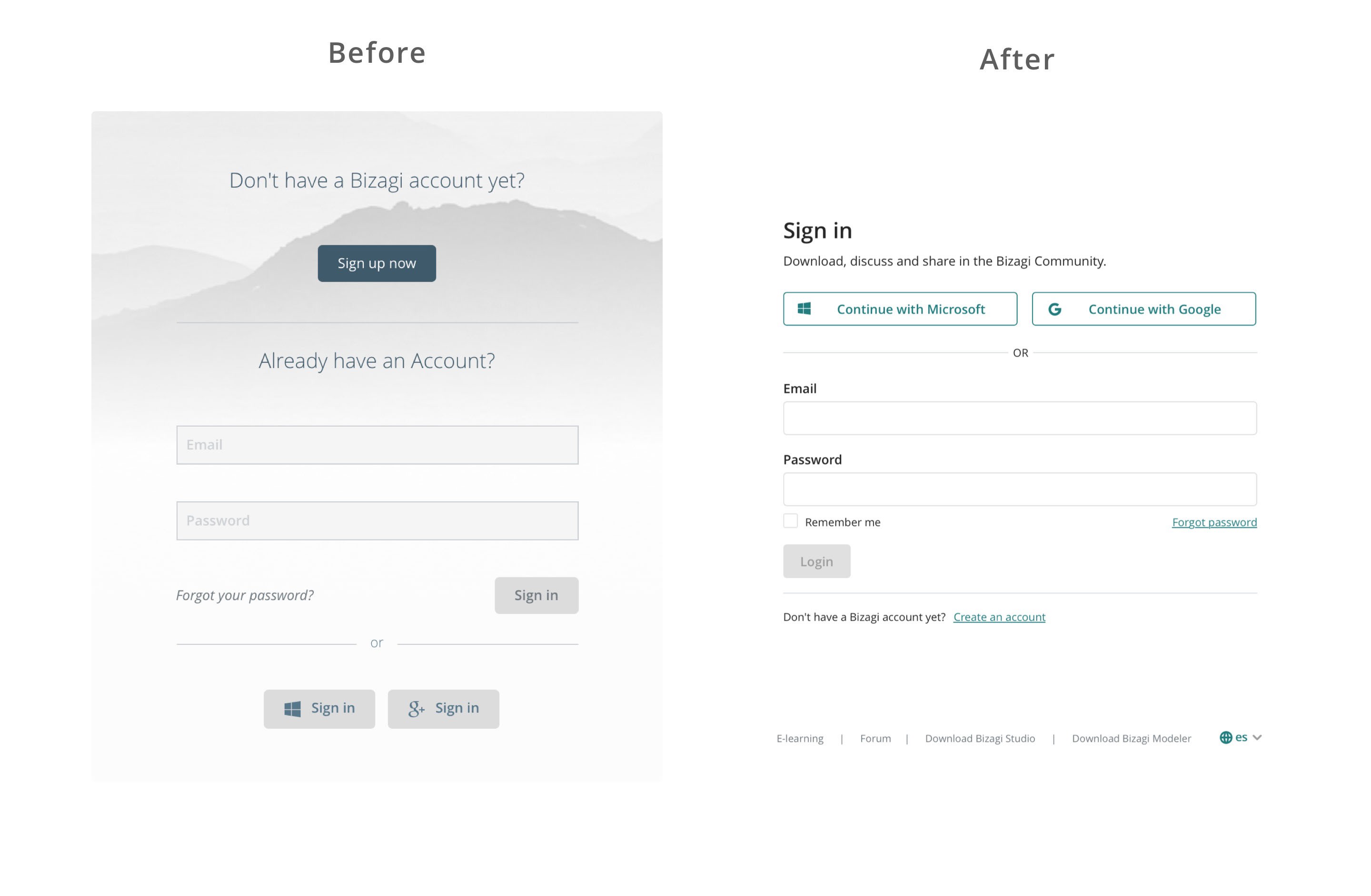
Understanding the problem
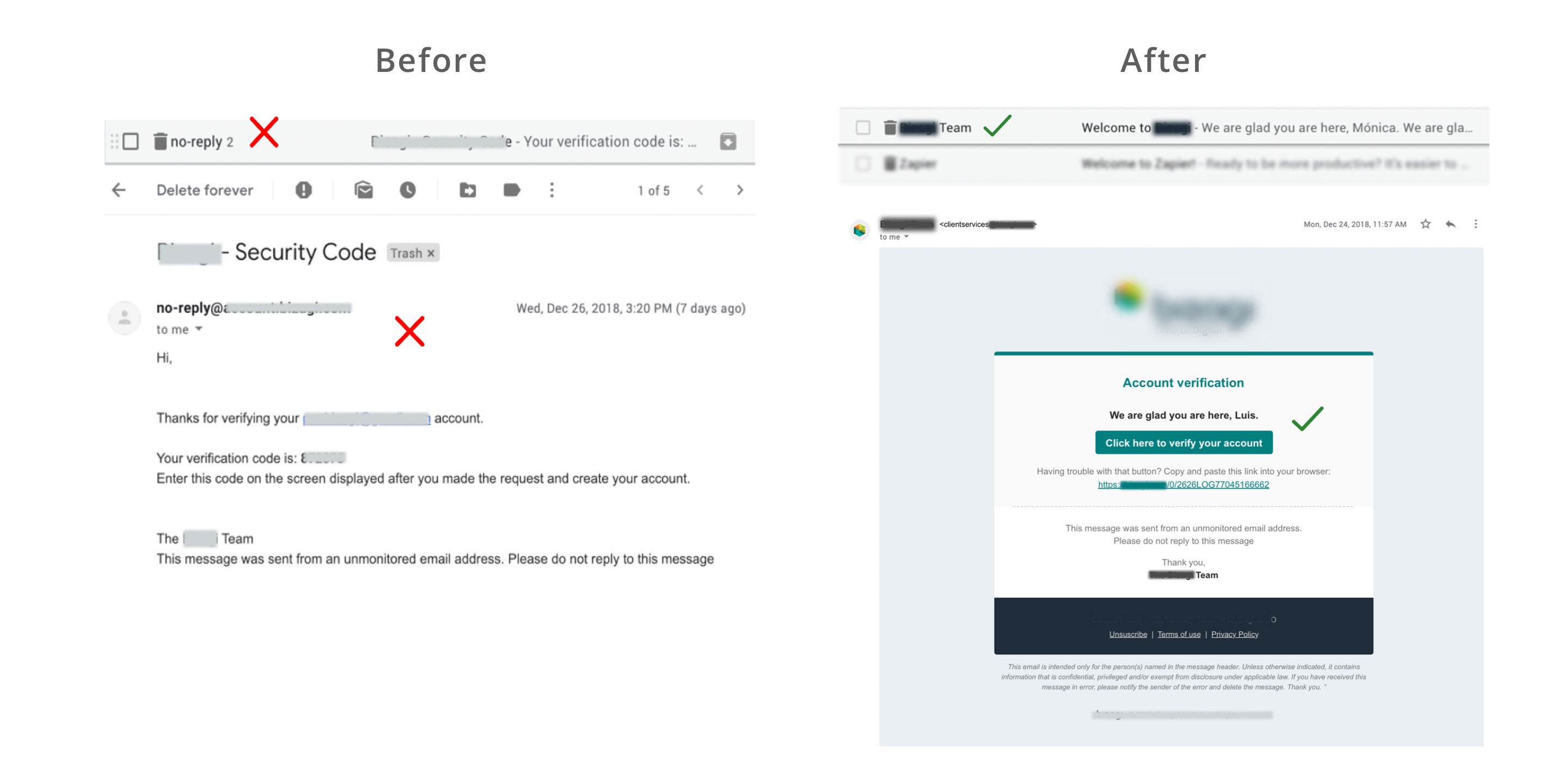
The communication on the email was improved to avoid spam filters:
Use a recognizable sender name
Use a custom email.
Include a legal name and address.
Include an “Unsubscribe” link at the bottom.
Do not use obscure fonts: Stick with fonts that work across platforms, like Arial, Verdana, Georgia and Times New Roman.
In product interfaces, the copy needed to be stronger and more knowledgeable. Consequently, every screen message was improved to inform end-users about what is happening on screen. Also, new or missing messages were developed to complete the experience on the interface:


Takeaways
It's an ongoing task, and I continue iterating on every message that the users need to understand when using our product.