Illustrations for Learning Environments
My Role
User Experience / Product Designer
Deliverables
Miro summary, Figma library
Tools
Miro, Figma
Use case
Learning environments tend to be lonely places, especially for students, and during the pandemic, this sense of loneliness increased radically.
In order to reduce the feeling of solitude on learning environment a make them warmer place, we build, based on users feedback, a series of illustrations to be used within our platforms and reduce the friction and frustration in specific scenarios.
Goal
Update the out-of-date style to offer a warm and friendly place for the learning environment.
Understanding the problem
A research study was conducted to validate expectations and current feelings of users. The study examined not only the feelings produced by the current illustration when users experienced an empty state, but also the level of bad/good satisfaction produced by this image.
The study employed three methods:
Survey.
User test.
Focus groups.
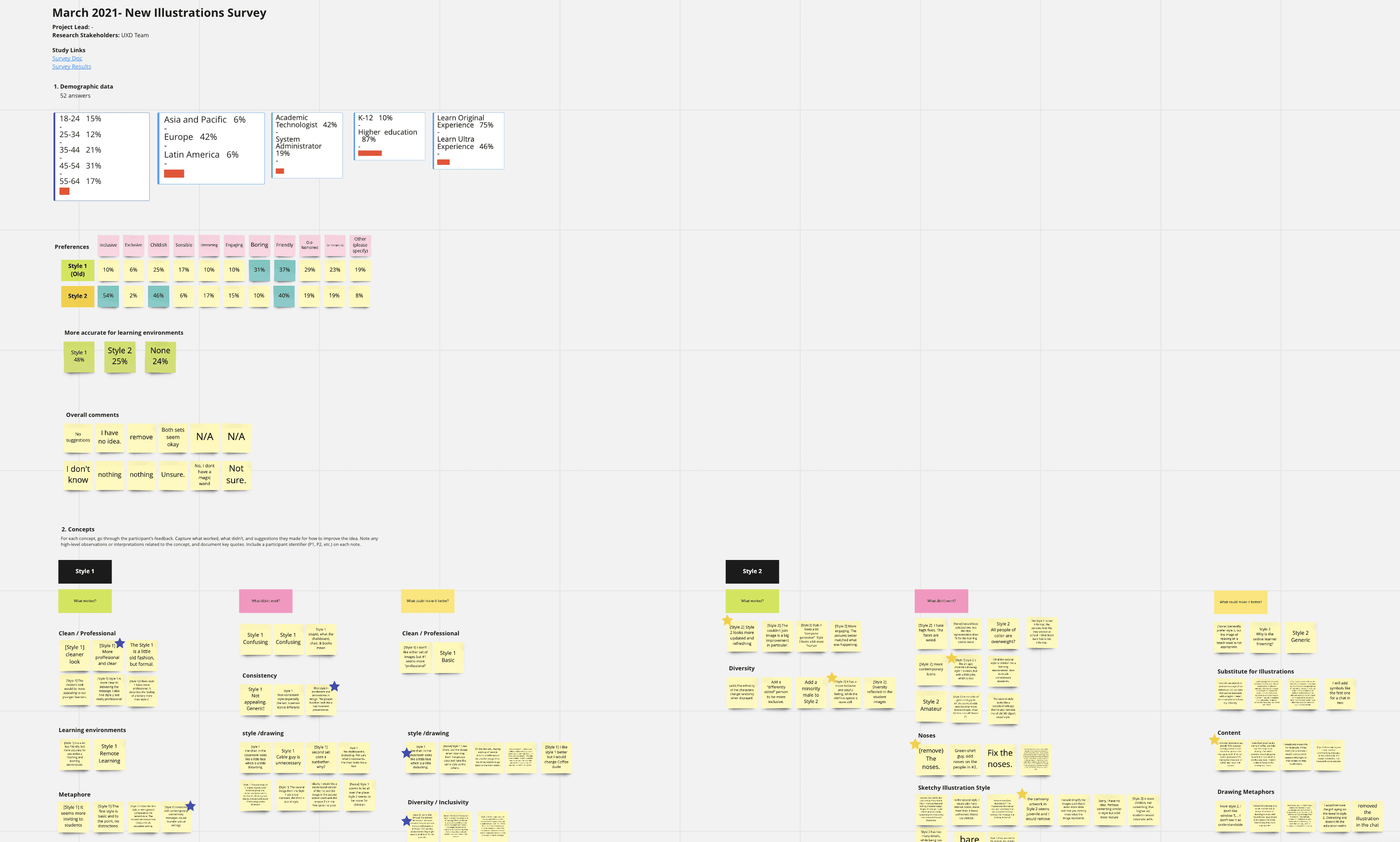

We not only got users feedback but also did a complete UX analysis, and we found that our current illustrations are:
Are outdated.
Are too complex.
Are not inclusive.
Shape concerns/issues.
Contrast issues.
Inanimate objects doesn’t feel friendly.
Main Insights
Although users declare that the new style feels more "Human" and unique. They want to see clarity and cleanliness in the illustrations.
They do find valuable the diversity and inclusion represented by the illustrations.
Small/specific details in illustrations may seem disturbing or hard to read, so we have to work to enhance those details.
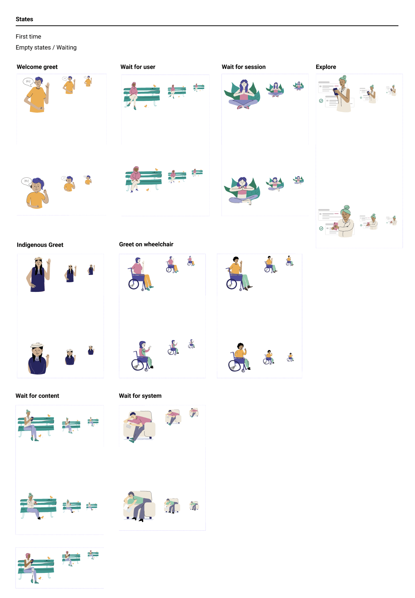
Scenarios
Empty/zero states (eg. no results; no content yet; lost connection; something went wrong)
On-boarding (eg. new feature, welcome screen, how-to’s,...)
Announcements (eg. achievements, upgrades, celebration moments,...)
Progress indicators (eg. profile completion, delivery status,...)
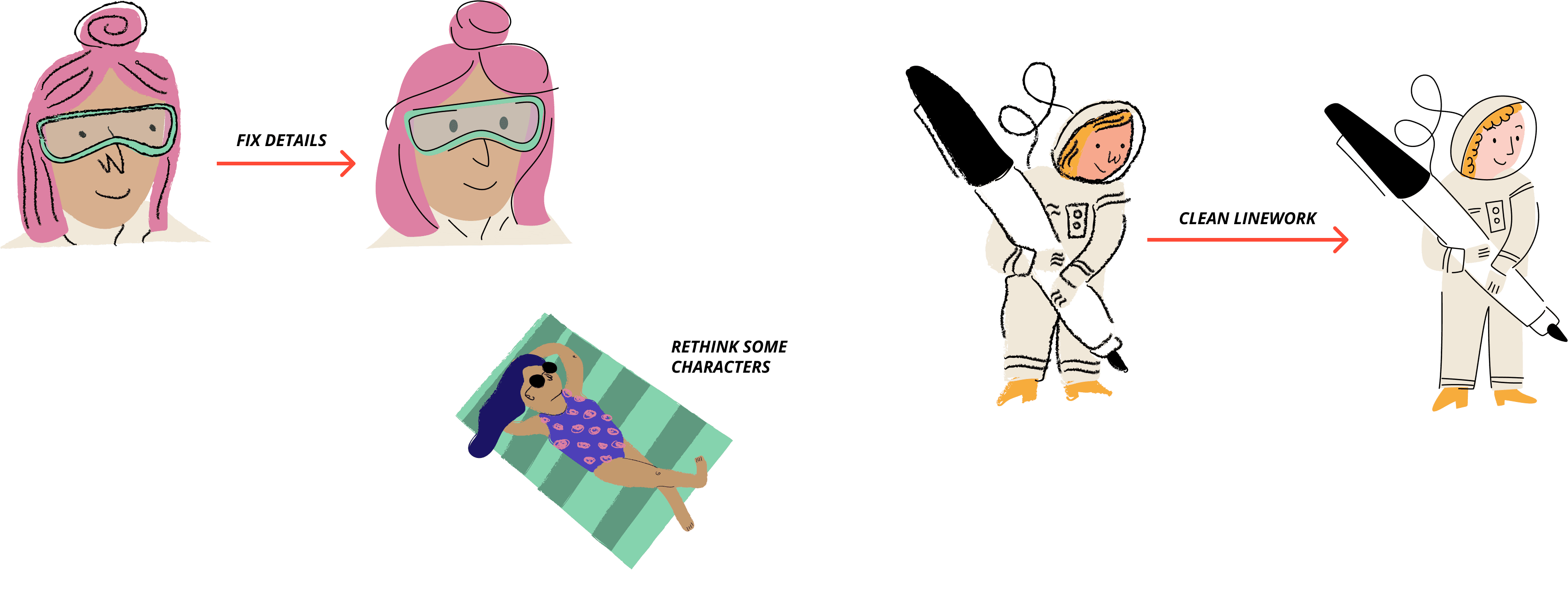
To review based on feedback:
Fix details:
Noses.
Disturbing shapes.
Unpolished line.
Clothes.
Clean linework.
More diversity scenarios/characters.
Review some scenarios/ metaphors.
Exploring and creating
A first approach was made to gather feedback about the overall perceptions of the current style and what can be done better.
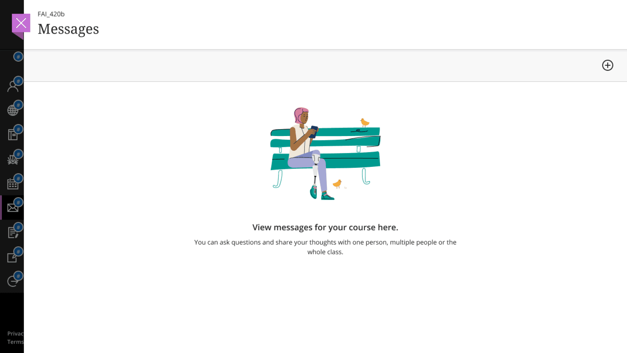
Subsequently, we introduced them into one of our products, Blackboard Assist, from which we have a good reception from users.

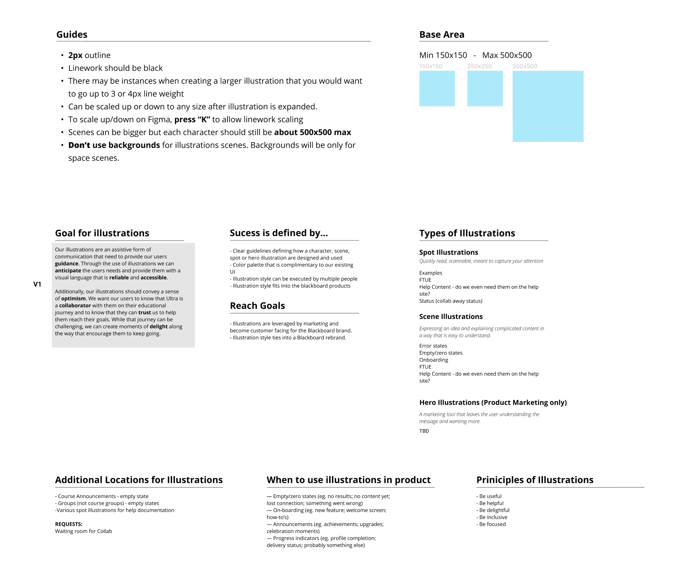
Guidelines creation
At Blackboard, we are committed to representing and including all our users. The guideline for illustration usage helps designers implement them effectively in any scenario.
Technical guides
Lines.
Scaling and sizing.
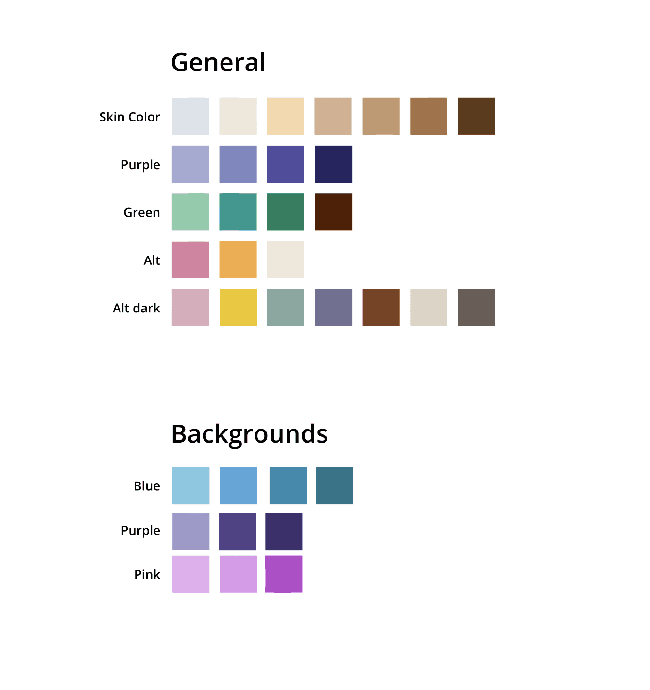
Skin color palette.
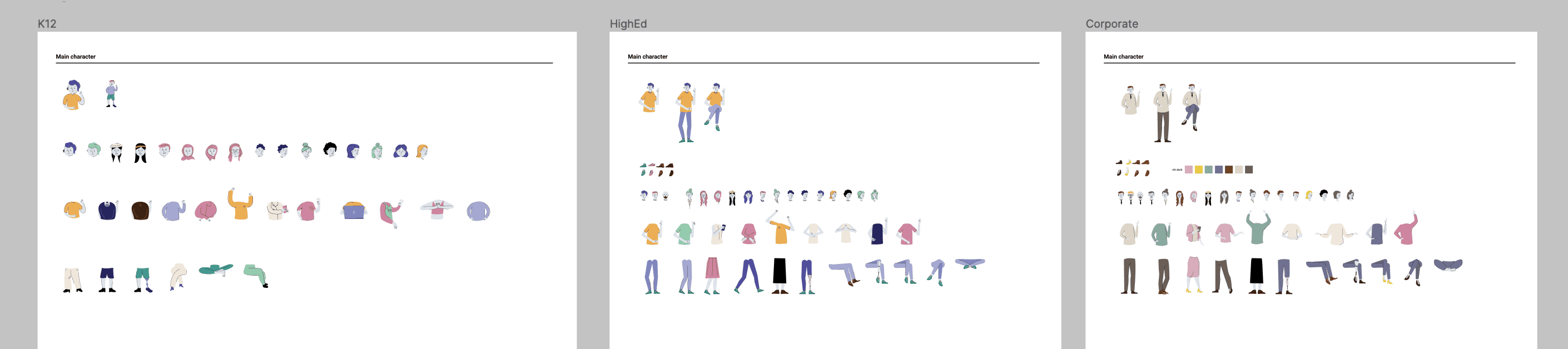
Figma Components:
Overall color palette.
Atoms for faces, body, legs.
Illustrations variants: Higher education, K12, Corporative.
Takeaways
The new illustrations will give us the chance to turn online environments from a lonely place to a warm place where users can find it comfortable, especially with this new reality we all have to face because of Covid-19.
Also to offer a refreshing and inclusive style to Blackboard illustrations.