Accessible Component Library for Blackboard Collaborate

My Role
User Experience / Product Designer
Deliverables
Figma mockup, Components library
Tools
Figma
Use case
Refactoring of components library for Blackboard Collaborate.
Challenges
Refactoring current UI to new development library.
Accessibility issues and fixes to aim AAA compliance.
Understanding the problem
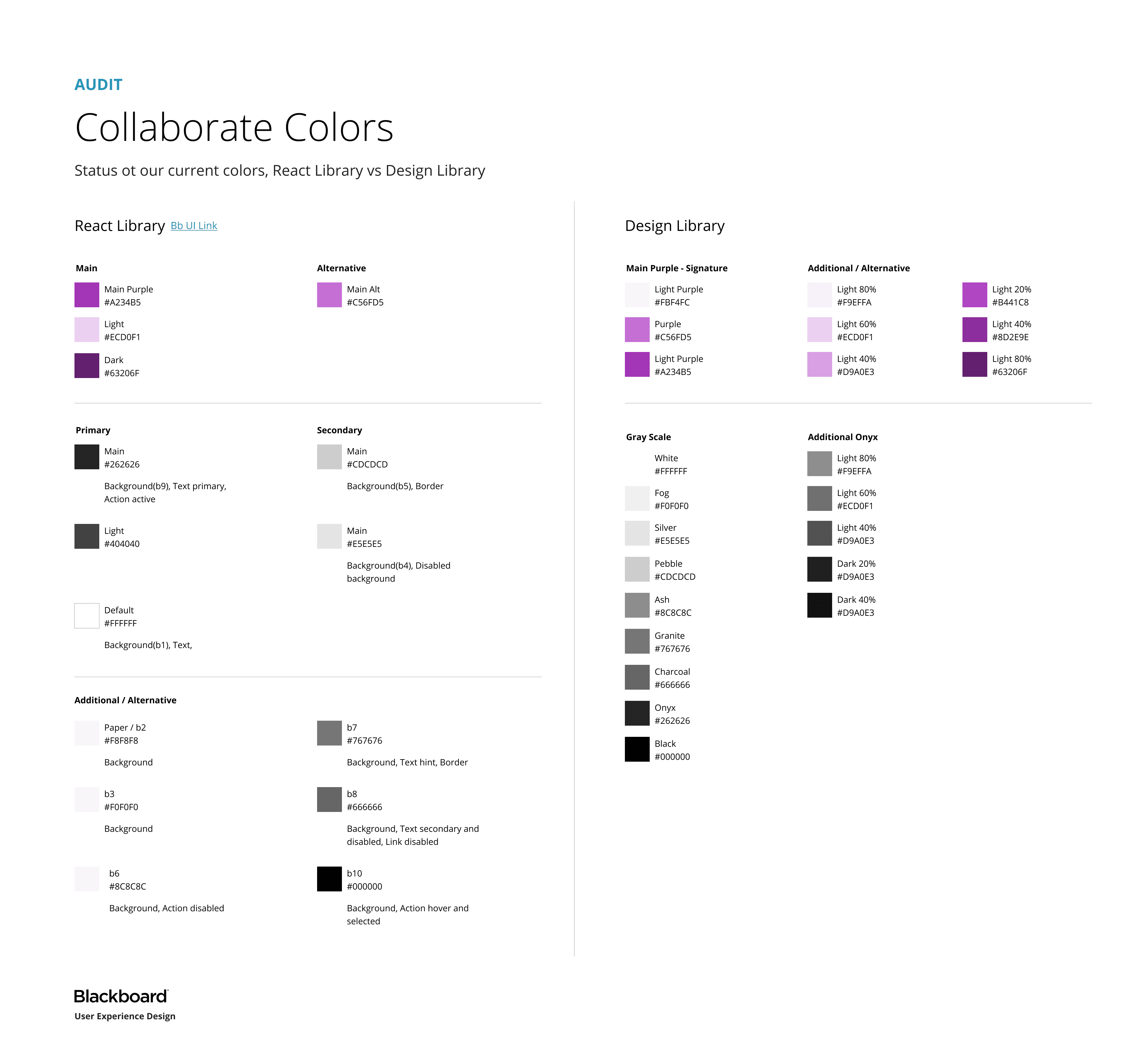
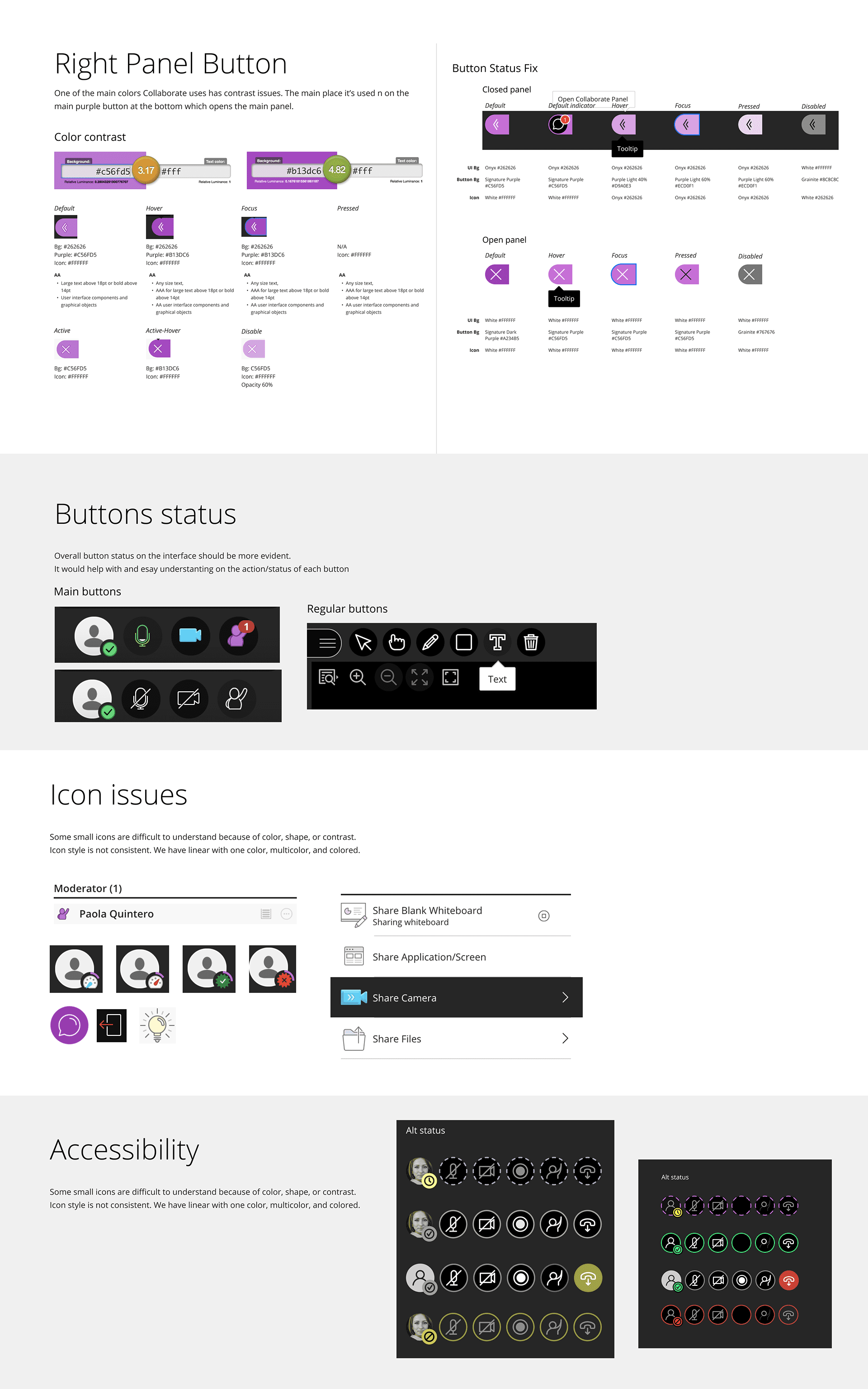
In order to enhance and aim for better compliance with accessibility and usability standards, a quick audit was ran to understand the current status of the UI and list all potential improvements to be done visually.
Exploring and creating
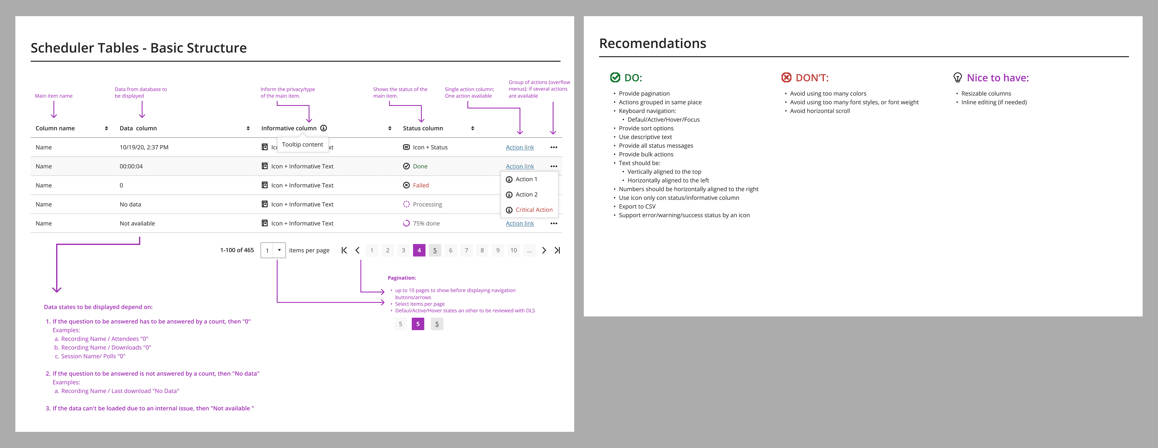
Furthermore, we analyzed specific components that may need to be redesigned and built into React, as a way to reduce technical debt and improve performance within the platform.
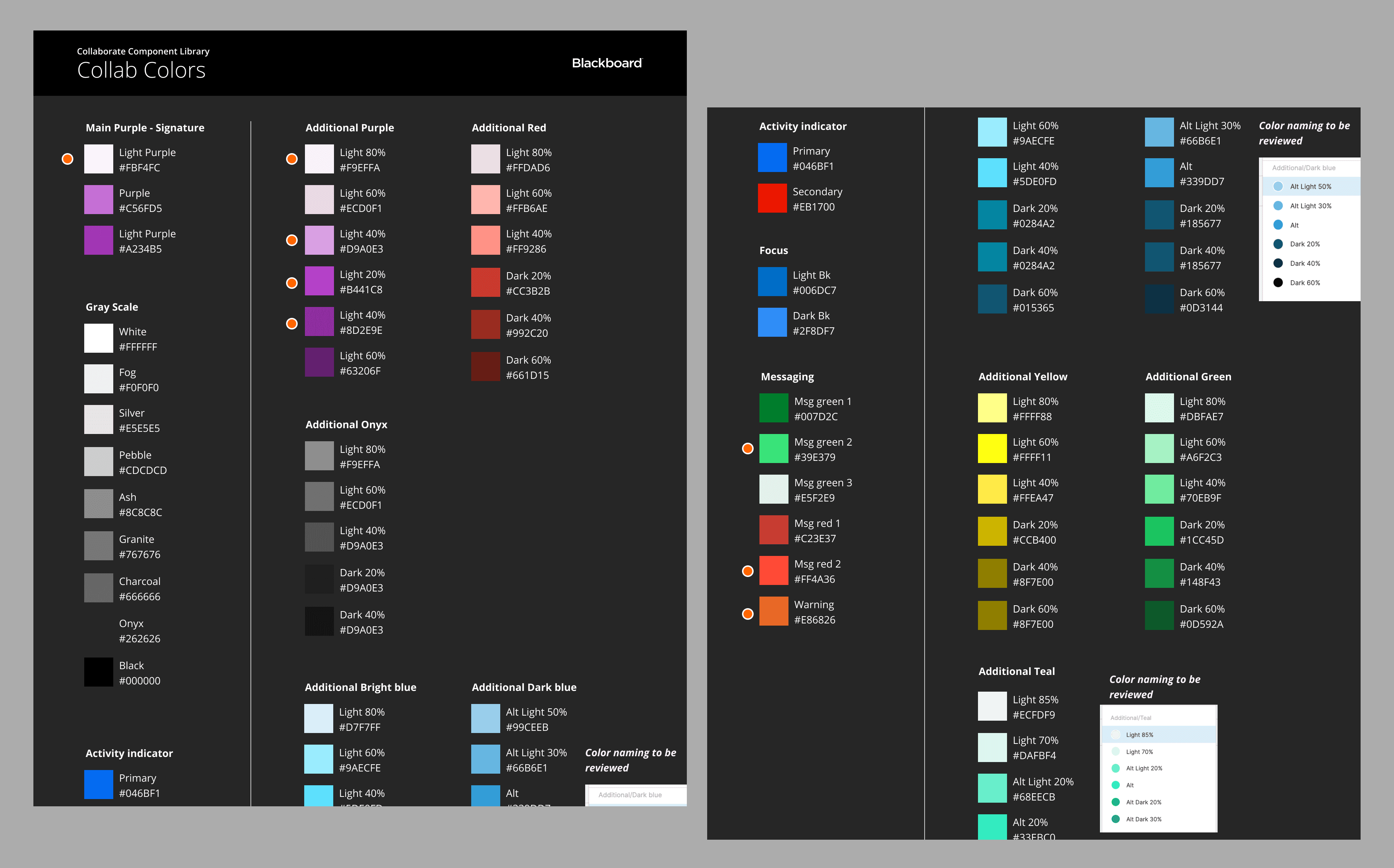
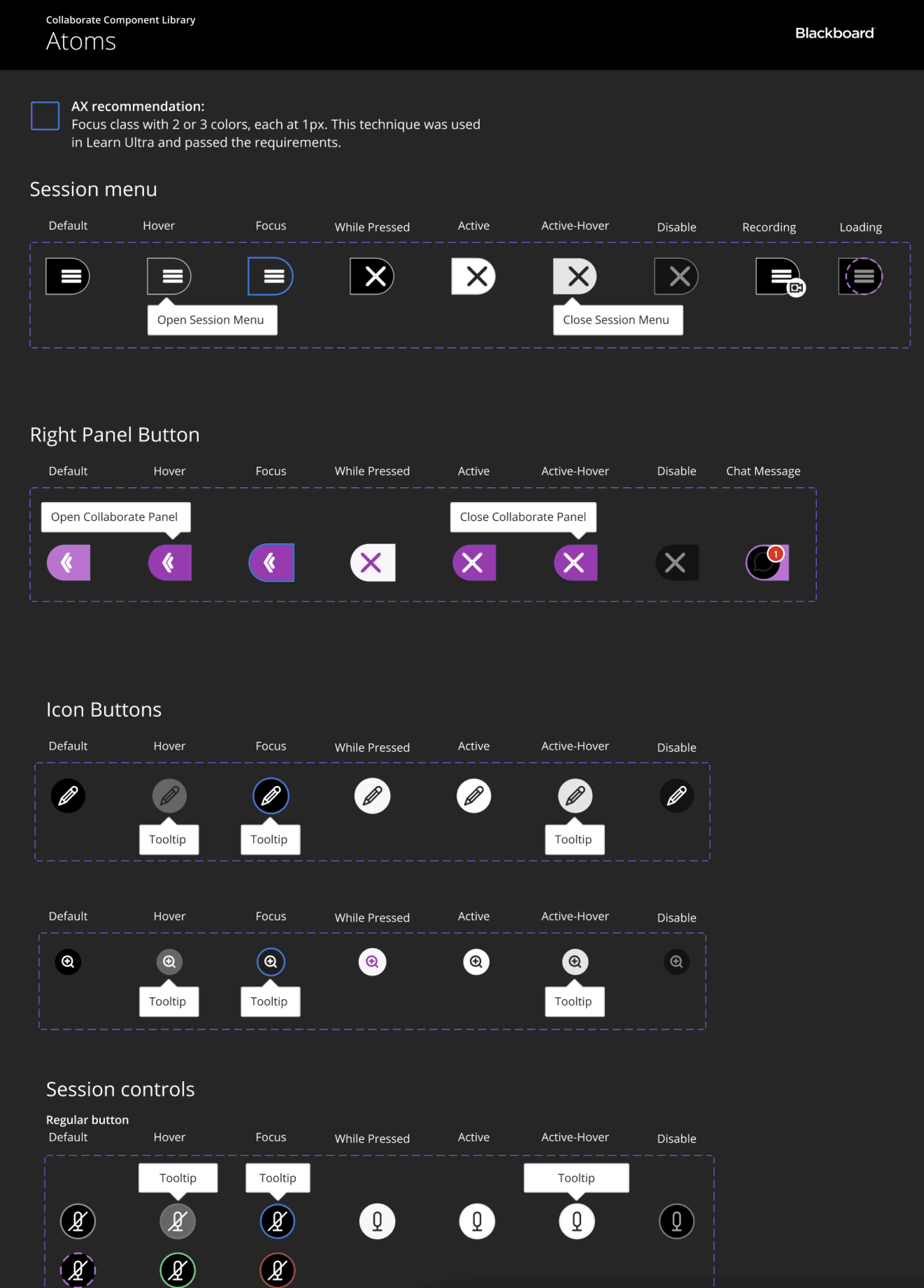
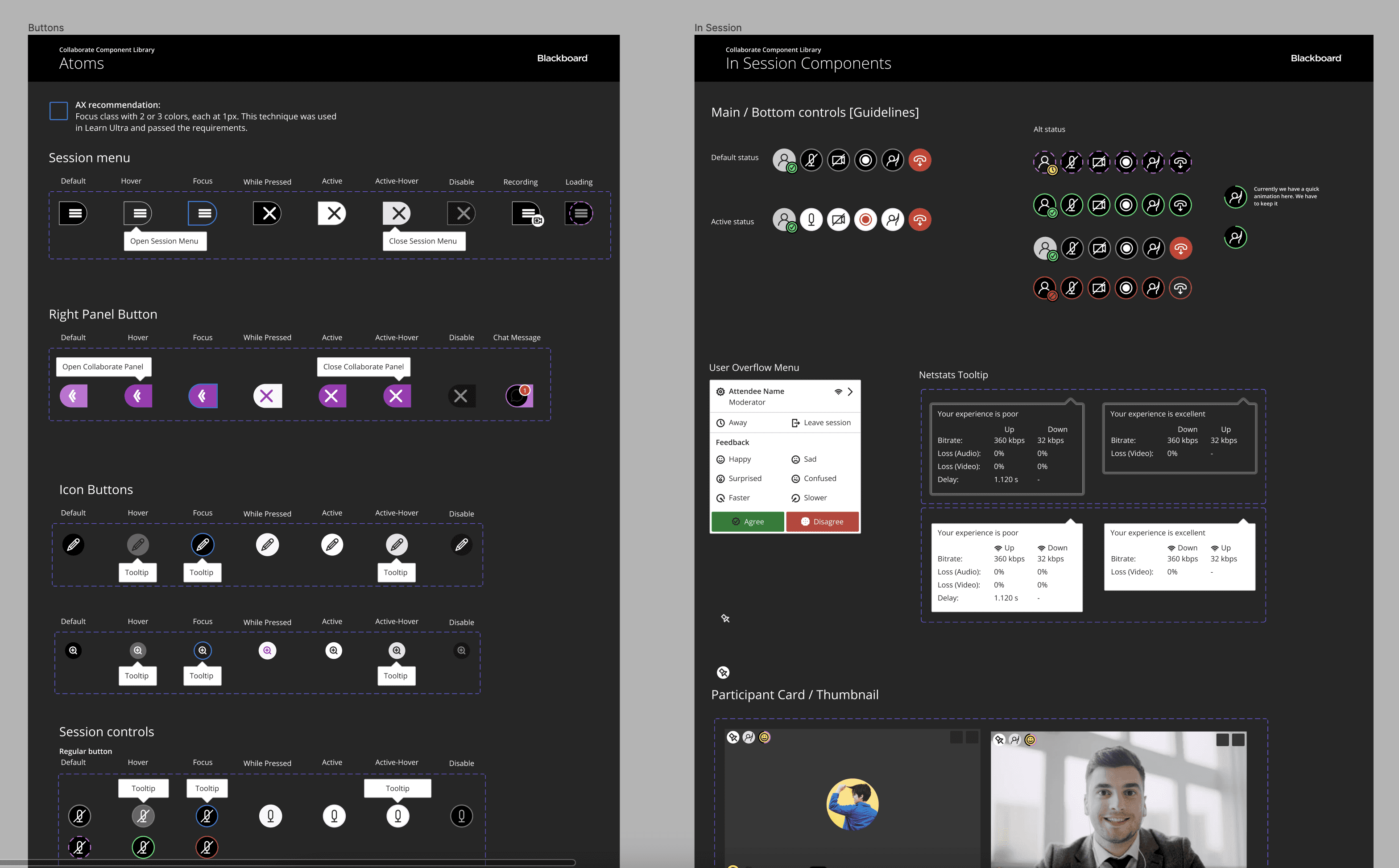
Once the audit was done, the component library was create following al recommendations and guidelines, include annotations about behavior and accessibility:
Color palette.
Atom components.
Status expected.
Accessibility test.
Main components and each status.
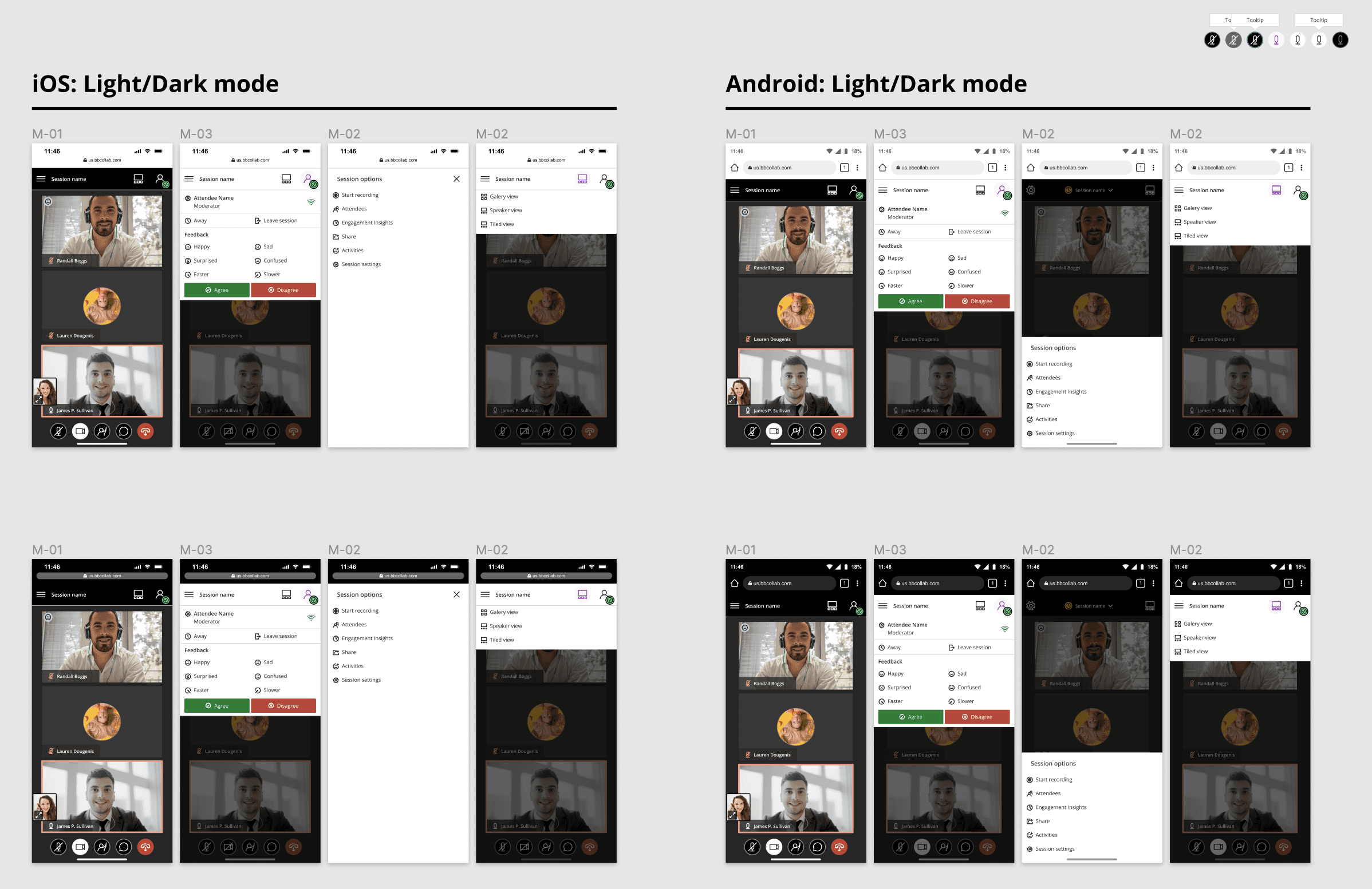
Device design:
Analysis and definition in terms of the operative system on the mobile phone.
iOS and Android explorations.
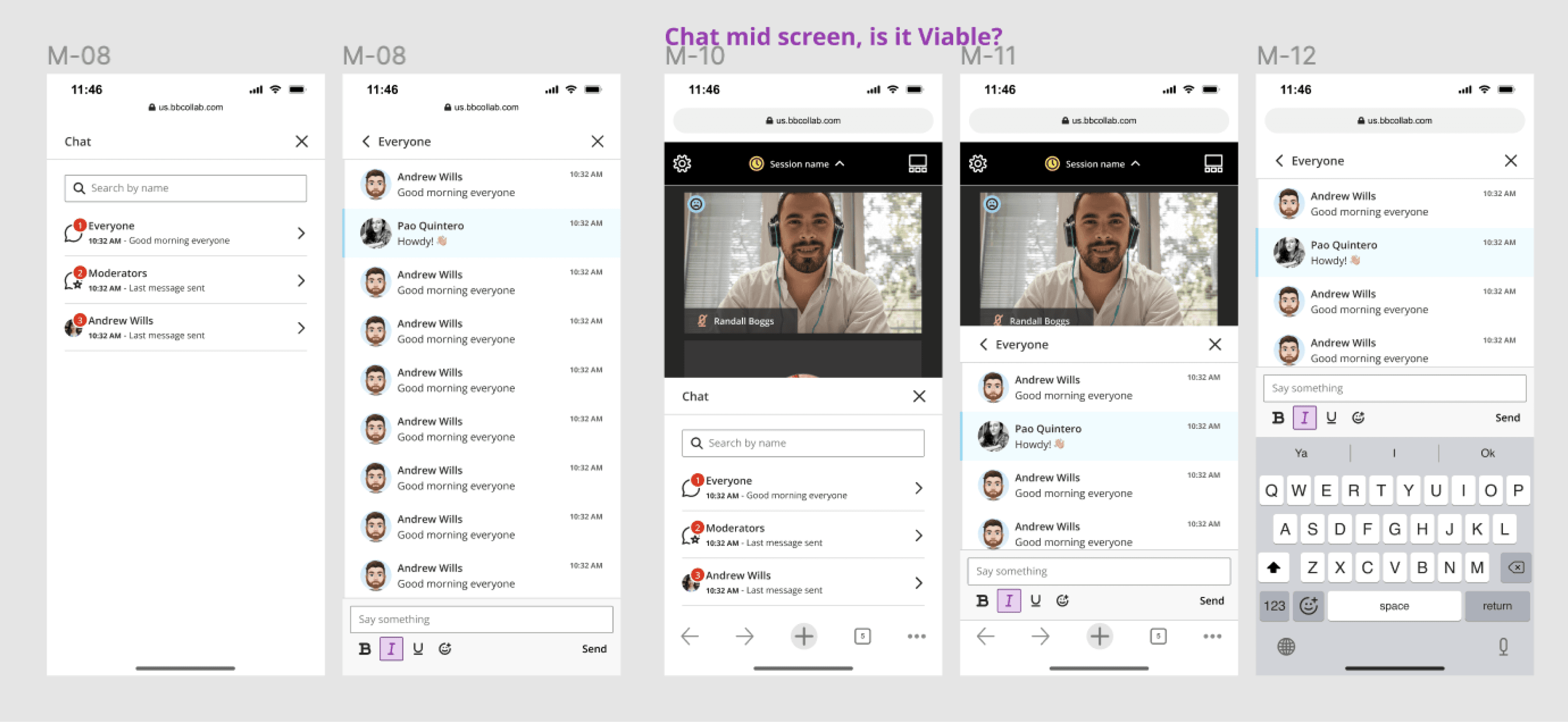
Internal features visuals: Chat and assistant list.

Takeaways
To conclude, we redesigned the product component library for Blackboard Collaborate to align with brand guidelines and achieve AAA accessibility compliance. By refactoring the user interface and addressing technical debt, we improved usability and performance. The detailed component library includes color palettes, atom components, and state expectations to improve the overall user experience.
For more information, explore the following links: