Reporting and Data Visualization
My Role
User Experience Designer
Deliverables
Miro board draft, Figma mockup
Tools
Figma, Miro
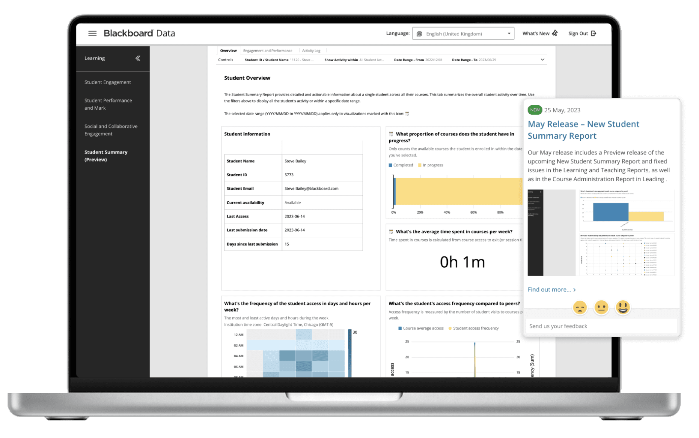
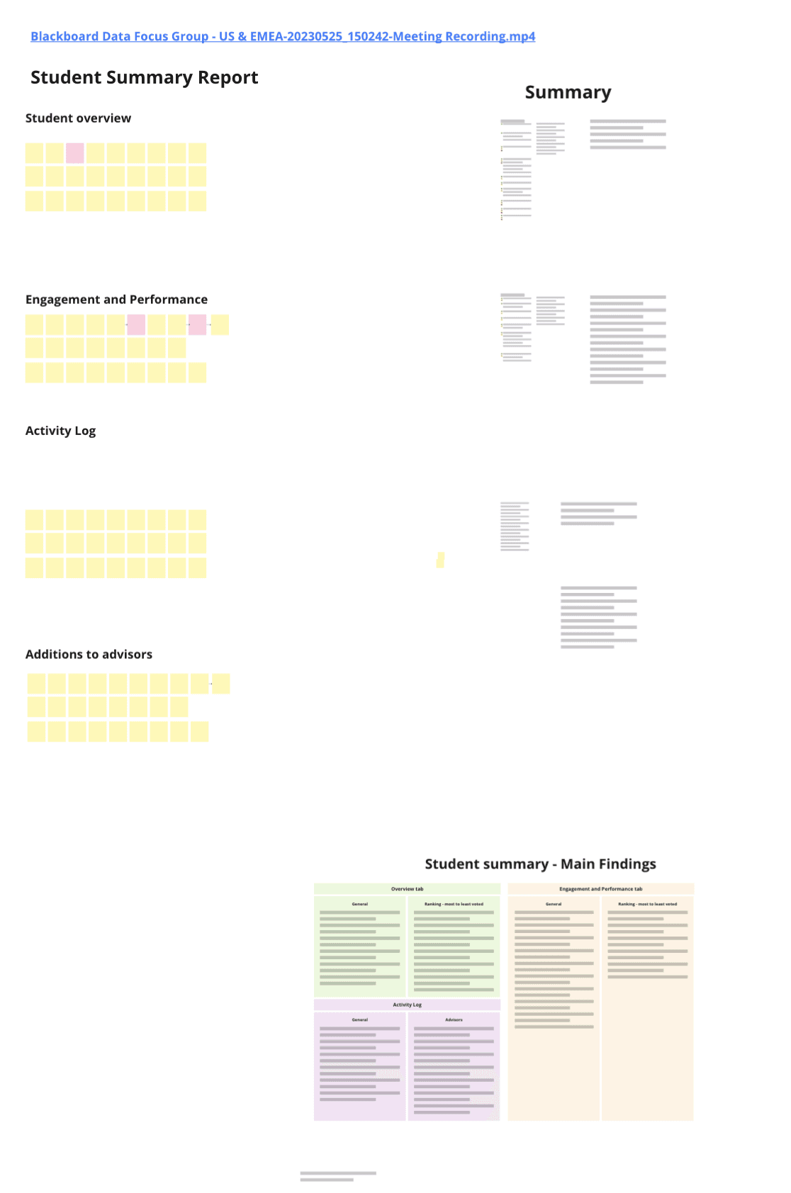
Use case: Student Report
Provide end-users with the data required to understand how is the student performing and engaging in their courses: student's progress per course, student's activity, participation and engagement, and student's performance by grades.
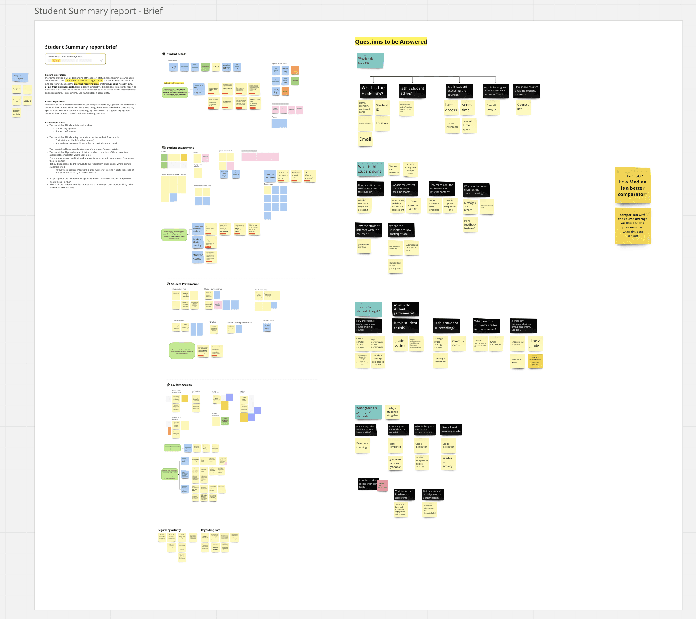
Understanding the problem
Intending to build a report that meets the user needs, we validated the data key points and the primary purpose of users to consult data of a single student.
Based on prior interviews and further validations with focus groups, we write down the main QTBAs that allowed us to have a very clear goal and direction for building better data visualizations.
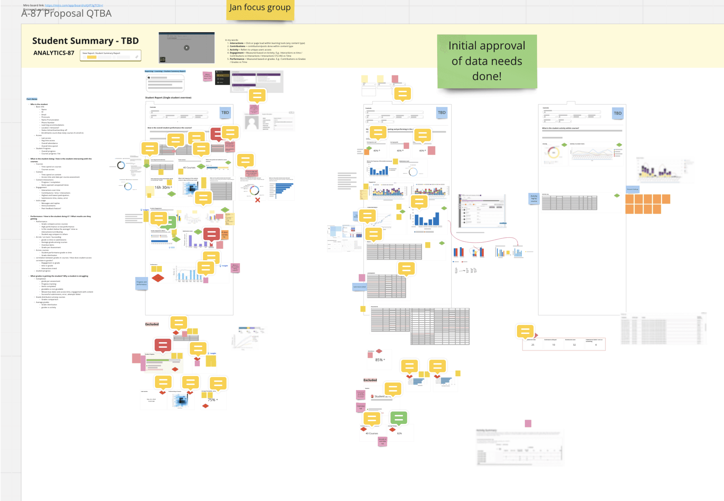
Exploring and creating
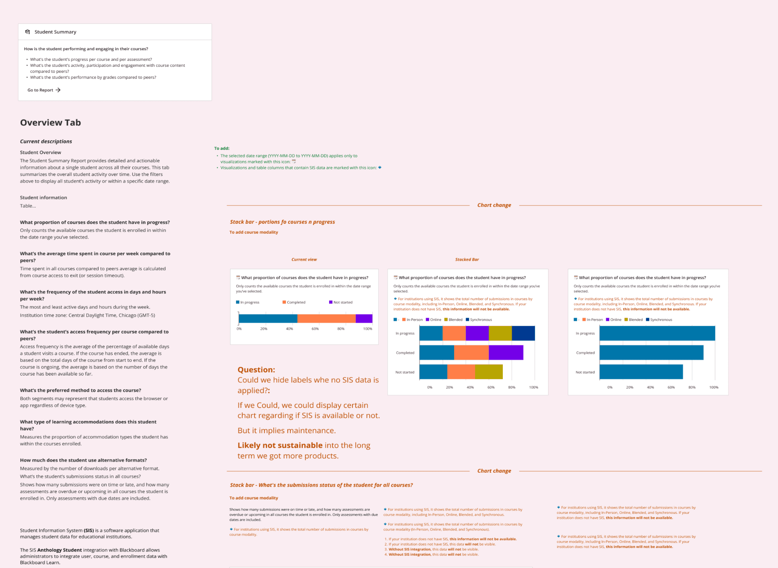
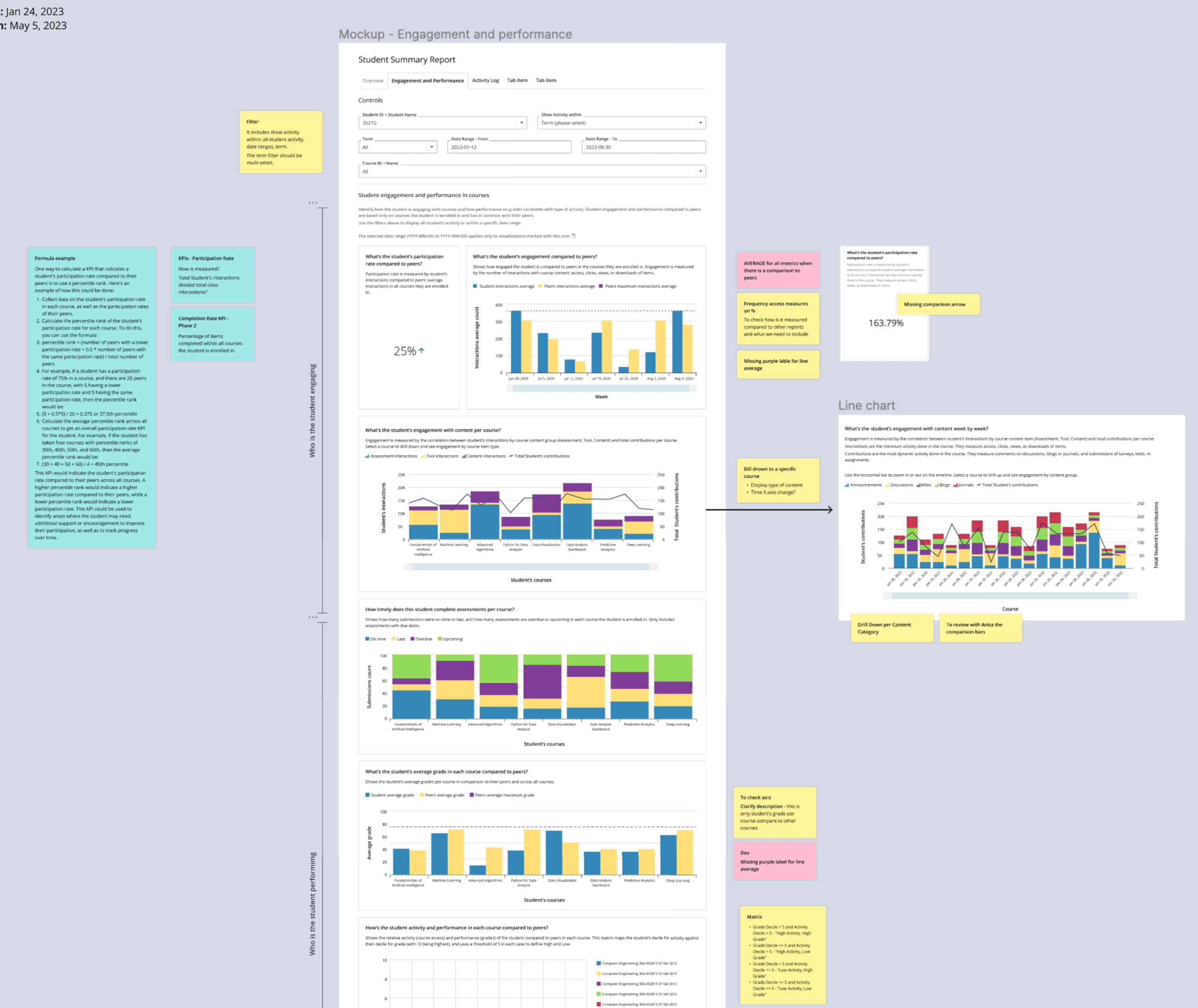
The report's design was a team effort between content and product designer (myself) to ensure that the storytelling and visual patterns meet the user's needs.
We iterated on how users read and interpret data on the screen and ensured that the data and chart descriptions were clear and understandable.
Alongside, we ran weekly sync with the cross-functional team to ensure we were aligned in the goals and planning of the project.
Materializing
Eventually, as an ongoing effort to validate with real users, the report was released to a closed group of institutions to get feedback on the final report before releasing it for general availability.
Learn more about Anthology Illuminate at https://www.anthology.com/products/institutional-intelligence/anthology-illuminate