Design System Upgrade

My Role
Product Designer
Deliverables
Figma libraries / Sharepoint site
Tools
Figma
Use case
Update the Student design system to make it more accessible and user-friendly, benefiting designers and improving product usability.
The Challenge
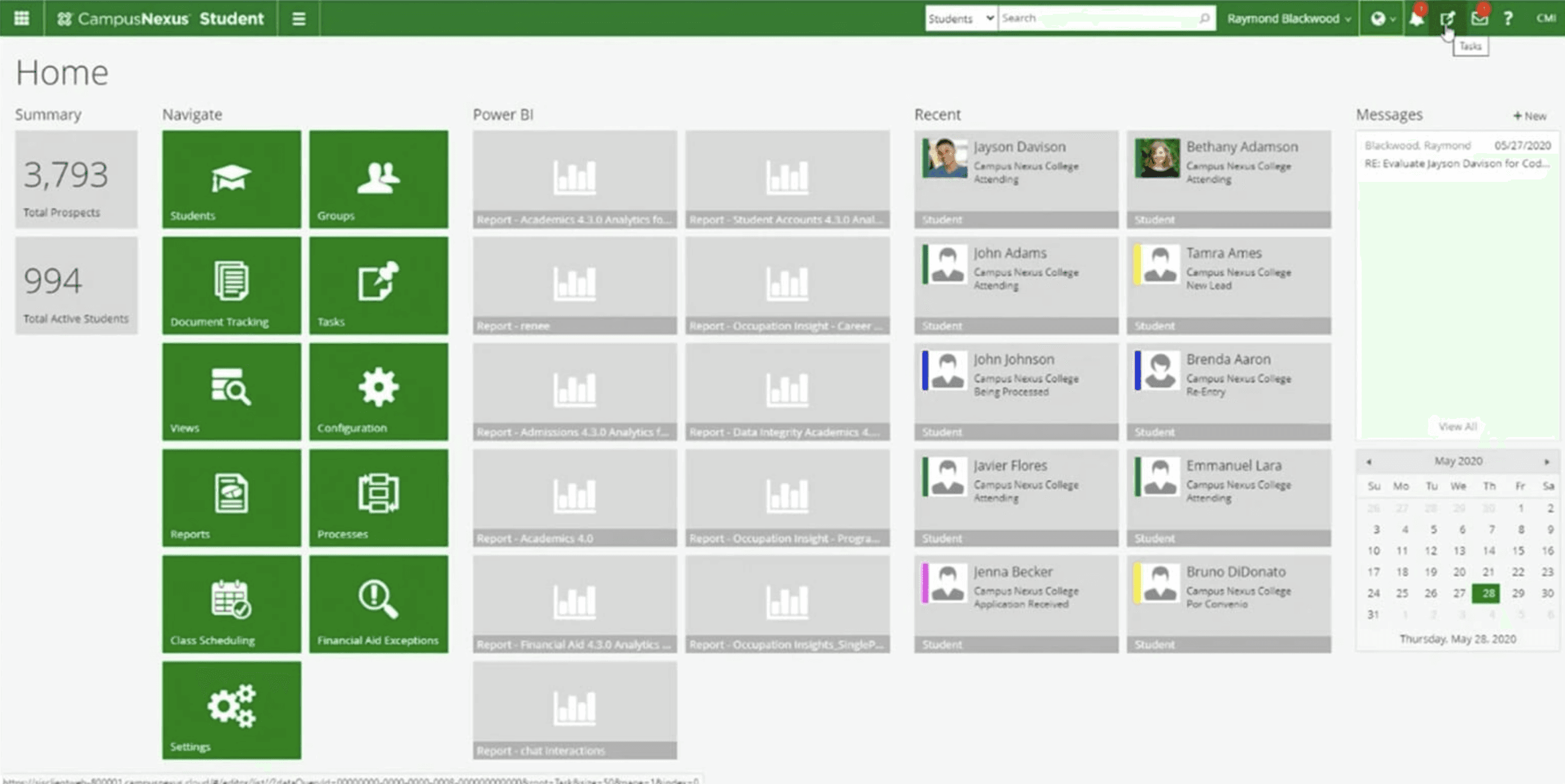
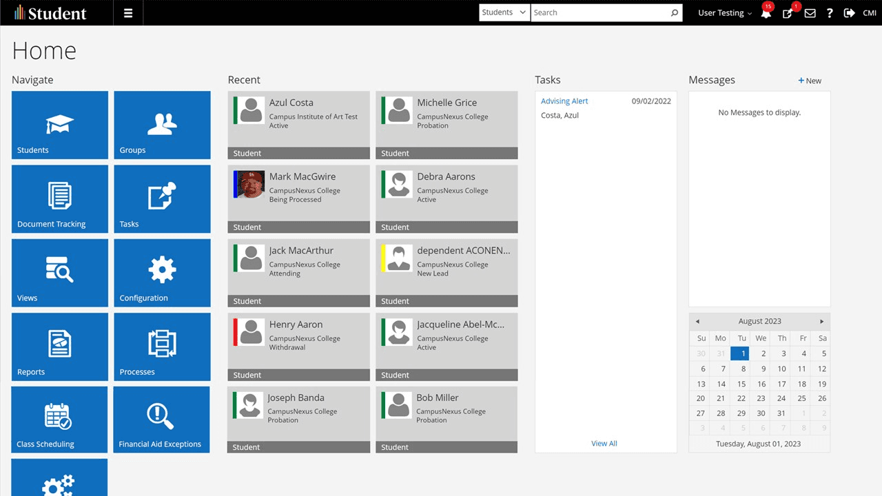
The Student product, originally known as CampusNext, had not seen a design update in over a decade. Inherited from a product that mirrored Microsoft's design style, it was now part of the Anthology umbrella, but was in need of significant upgrade.
The challenge was to revamp the design system to meet current standards while maintaining the product's established identity.
Understanding the problem
The Student product's outdated design library was causing issues with product effectiveness and usability.
Understanding the need to preserve the familiar Microsoft style while improving usability and consistency was critical. The goal was to create a cohesive design system that would streamline updates, improve the user experience, and reflect modern design principles.
Core Elements and Structure
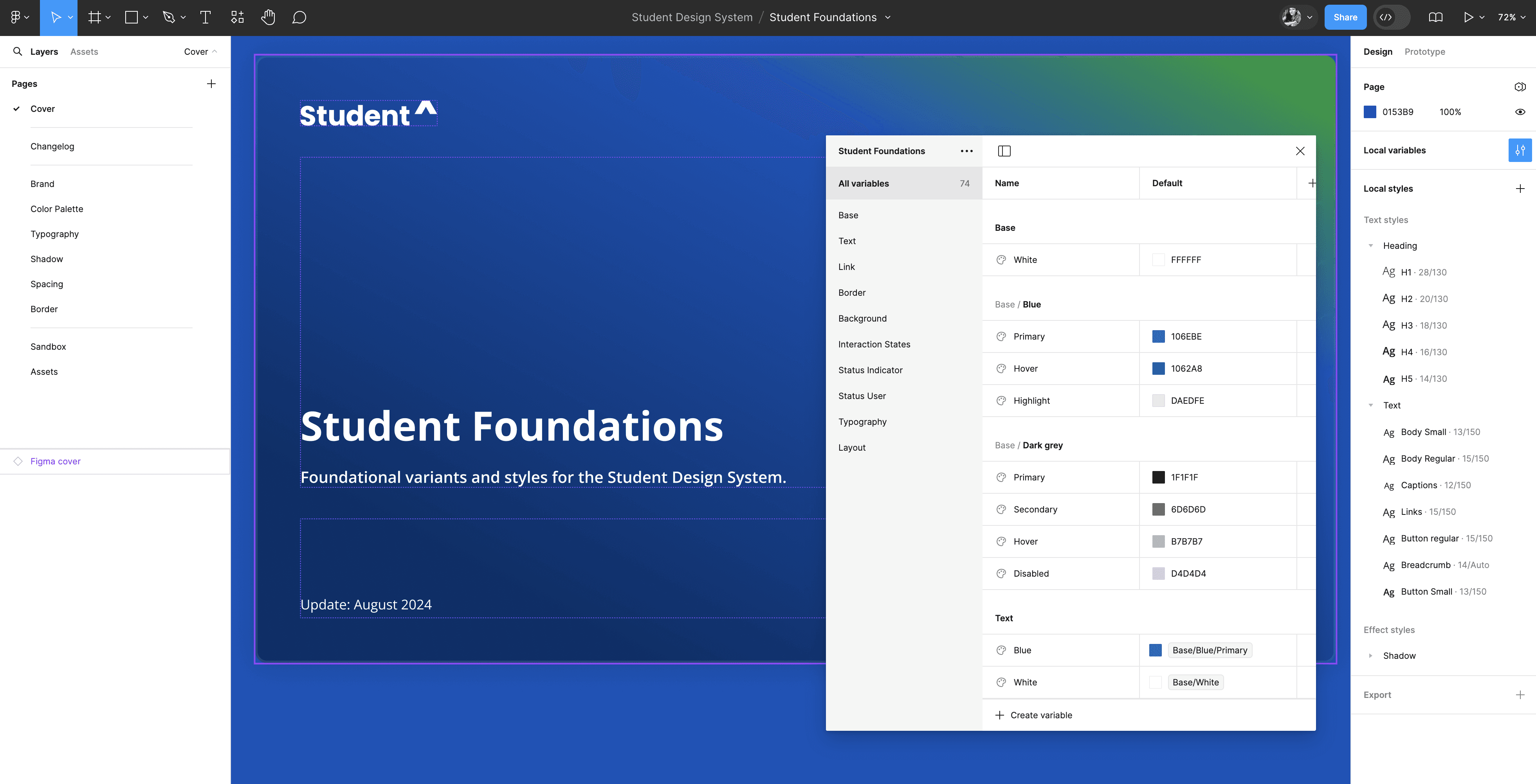
Foundations
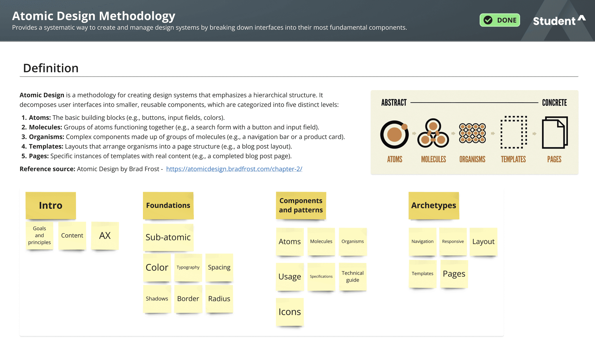
The foundation of the design system is built on the Atomic Design methodology, which lays the groundwork for a cohesive and scalable design. This foundation includes several key elements:
Core Principles: Establishing guiding design principles to ensure consistency and alignment with the product's legacy and modern requirements.
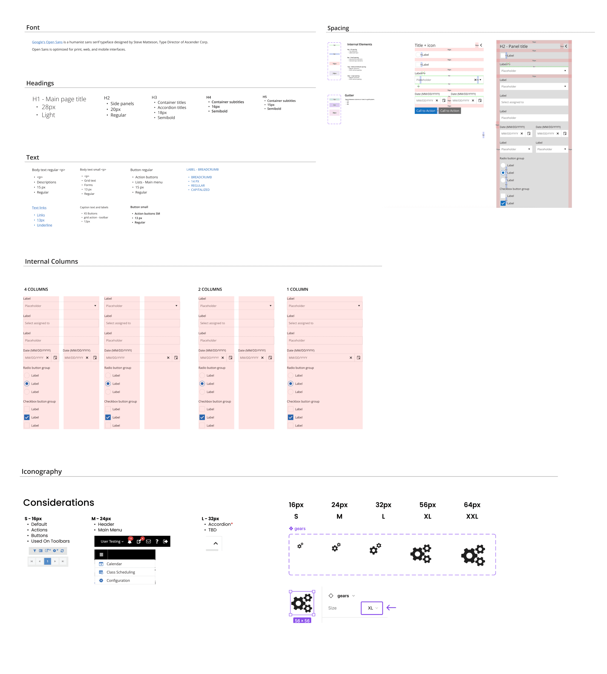
Color Palettes: Defining primary, secondary, and accent colors to create a unified visual identity. Variants of color palettes are also established to cater to different states and themes, ensuring versatility across various design contexts.
Typography: Selecting typefaces, font sizes, and weights that align with the product's visual language and readability standards. Variants of typography styles are provided to accommodate different content types and hierarchy levels.
Iconography: Developing a set of icons that reflect the product's functionality and visual style. Variants of icons are included to support different use cases and contexts.
Design Tokens: Utilizing design tokens to manage design decisions systematically and consistently. Design tokens are a set of variables (such as colors, typography, spacing) that ensure uniformity and simplify updates across the design system.
These foundational elements serve as the bedrock for the design system, enabling consistent, adaptable, and scalable design throughout the product.
Components
The components library, sourced from Telerik, was meticulously crafted to ensure design consistency and efficiency. Each component, from buttons to complex layouts, was updated or newly created to fit within the new design framework.
These components were designed to be flexible, reusable, and easily adaptable to various contexts within the product.
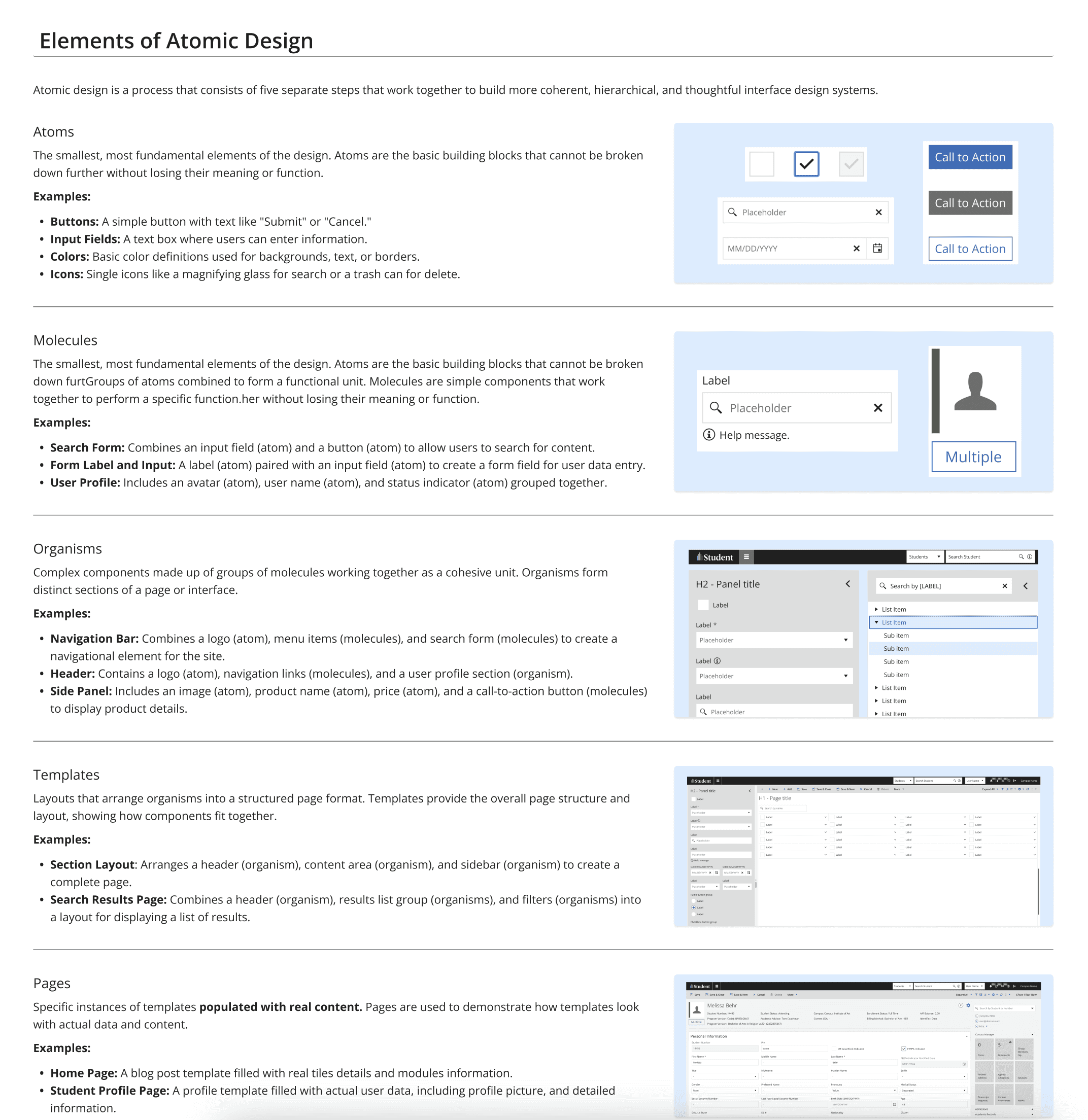
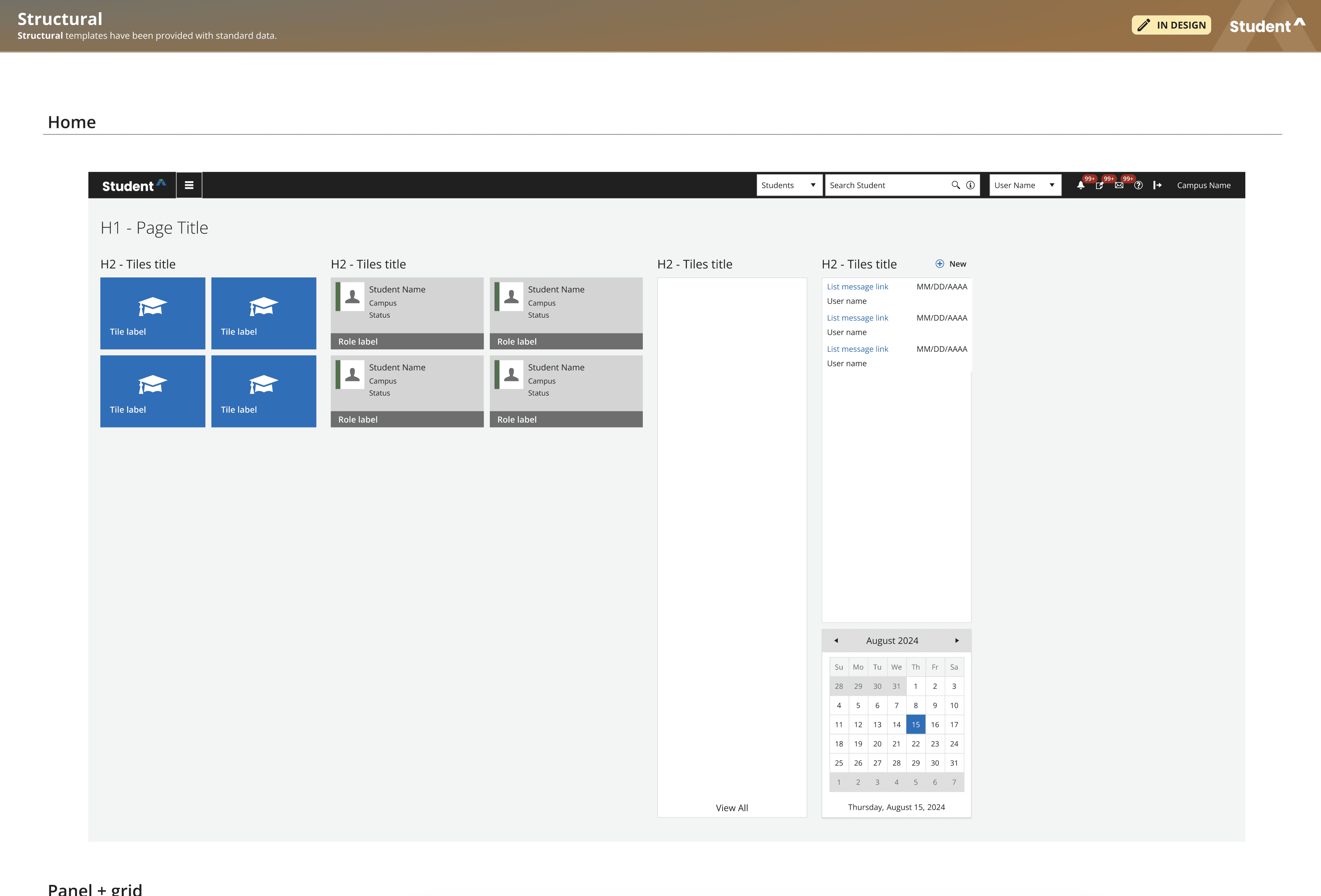
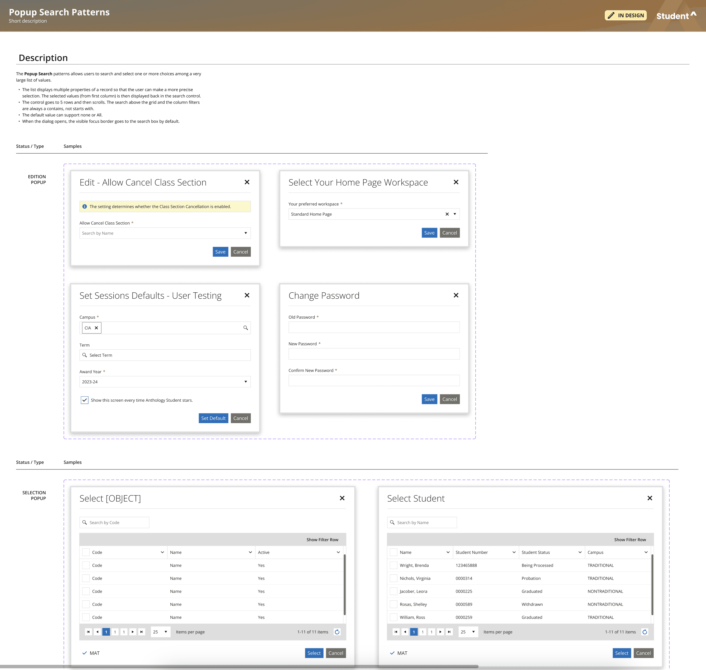
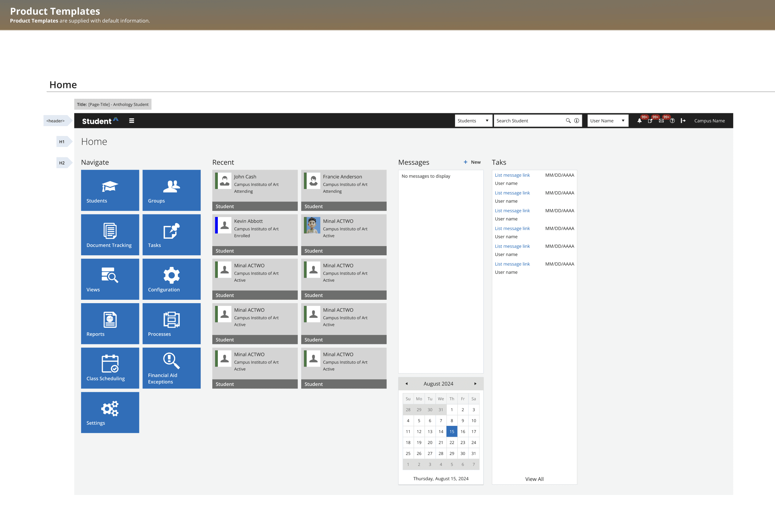
Templates
Templates were developed to provide consistent structures for different pages and functionalities within the product. These templates were essential in ensuring that the product’s design remained cohesive across different use cases, from simple data entry screens to more complex dashboards.
Integrating Accessibility into the Design System
Building the Student Design System from the ground up allowed me to integrate accessibility from the start, rather than as an afterthought.
The following key considerations were identified:
Ensuring color contrast across various backgrounds and interaction states.
Verifying font sizes and touch targets for mobile usability.
Adding descriptive text labels to actions.
Maintaining consistency across layouts and UI elements.
Although there is always room for improvement and a certain degree of compromise due to time constraints, this approach establishes a robust foundation and makes adherence to accessibility standards a collective objective.
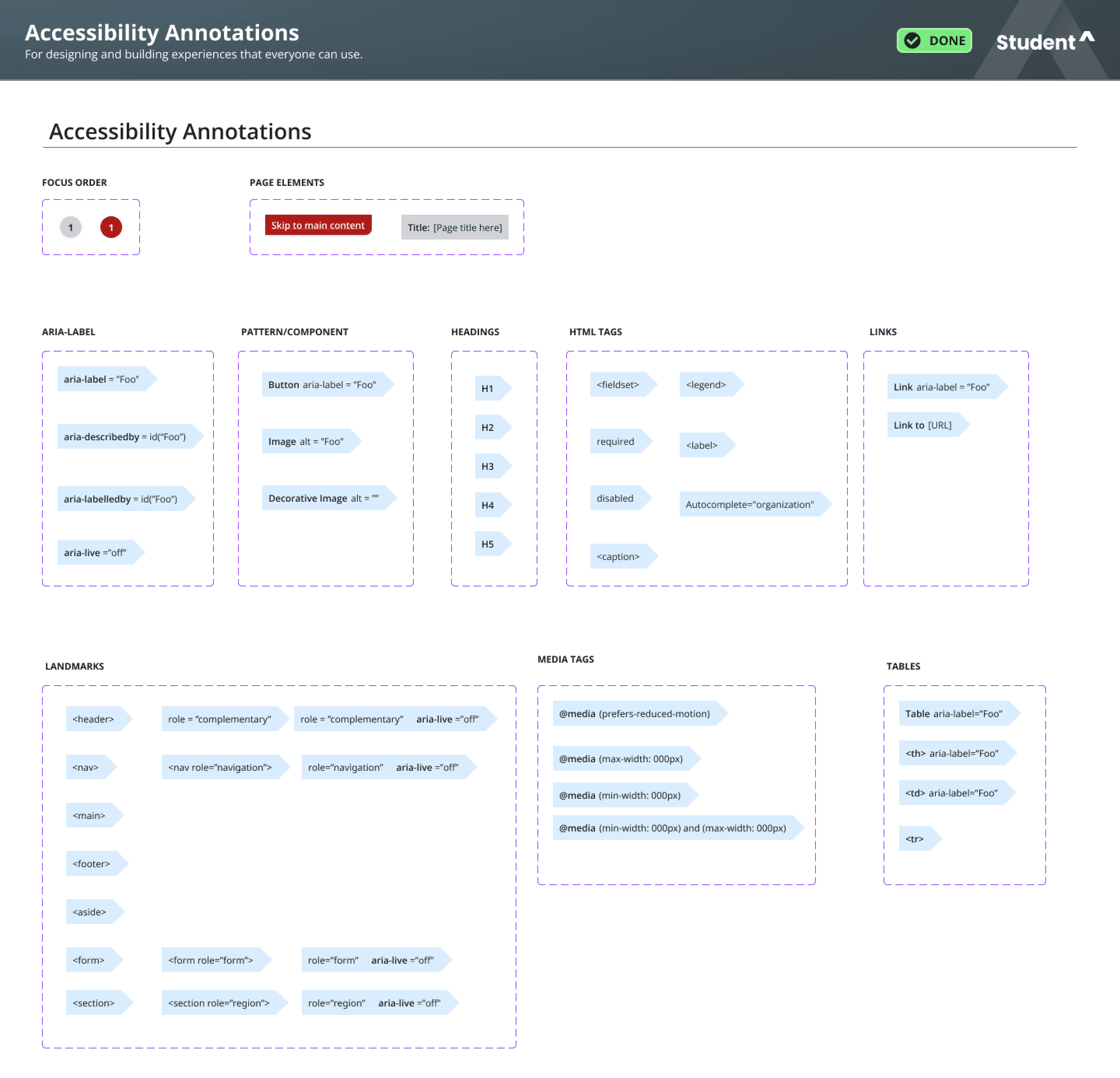
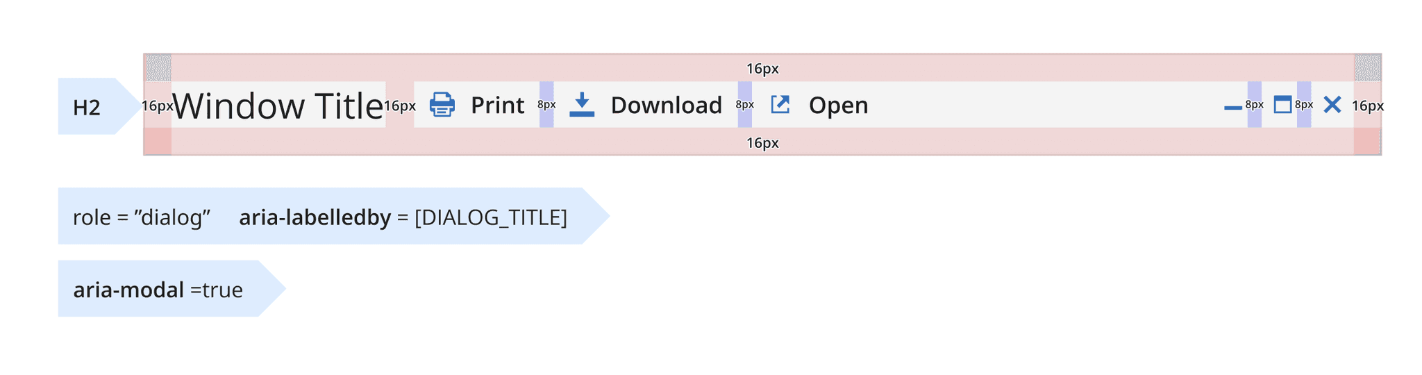


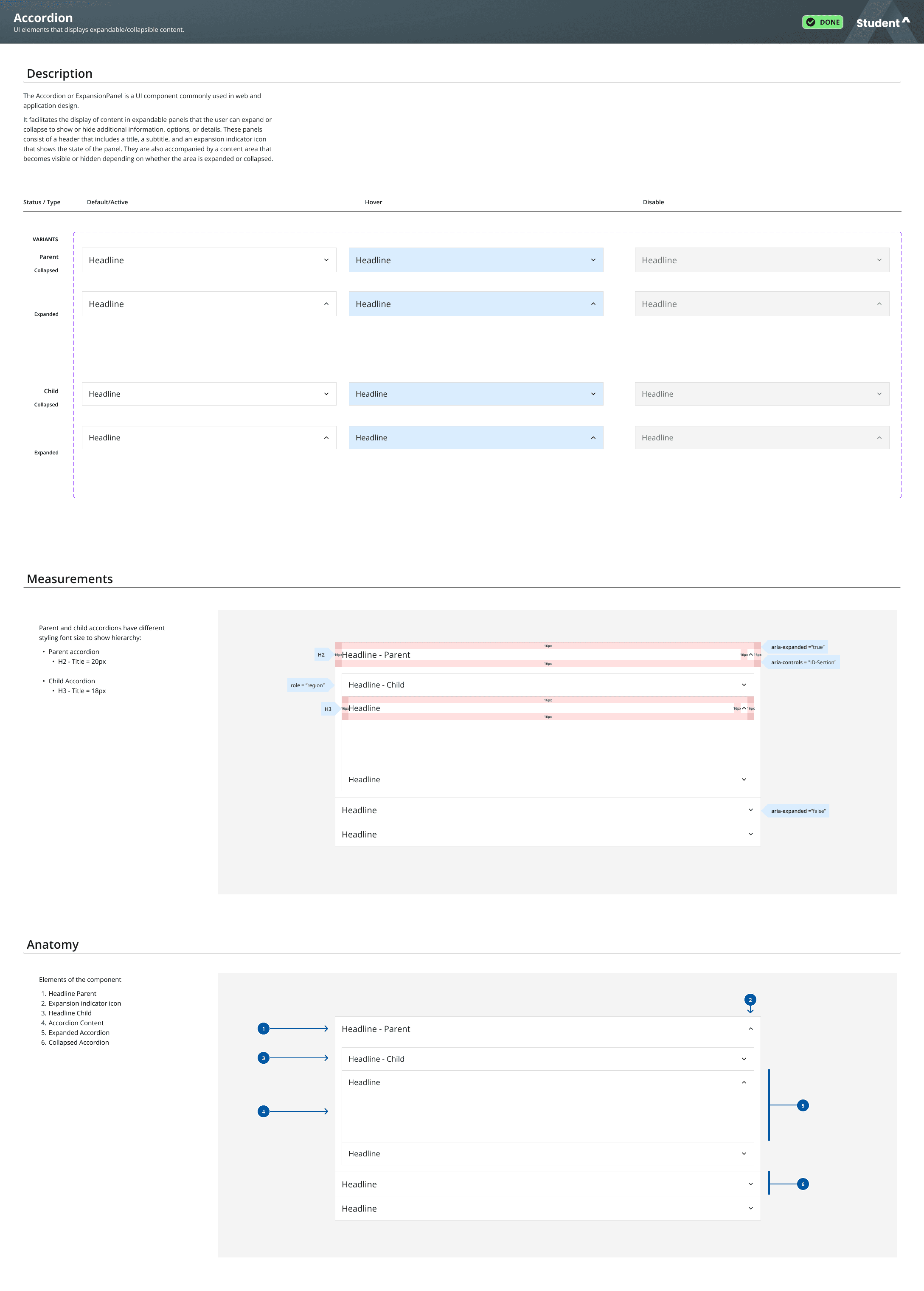
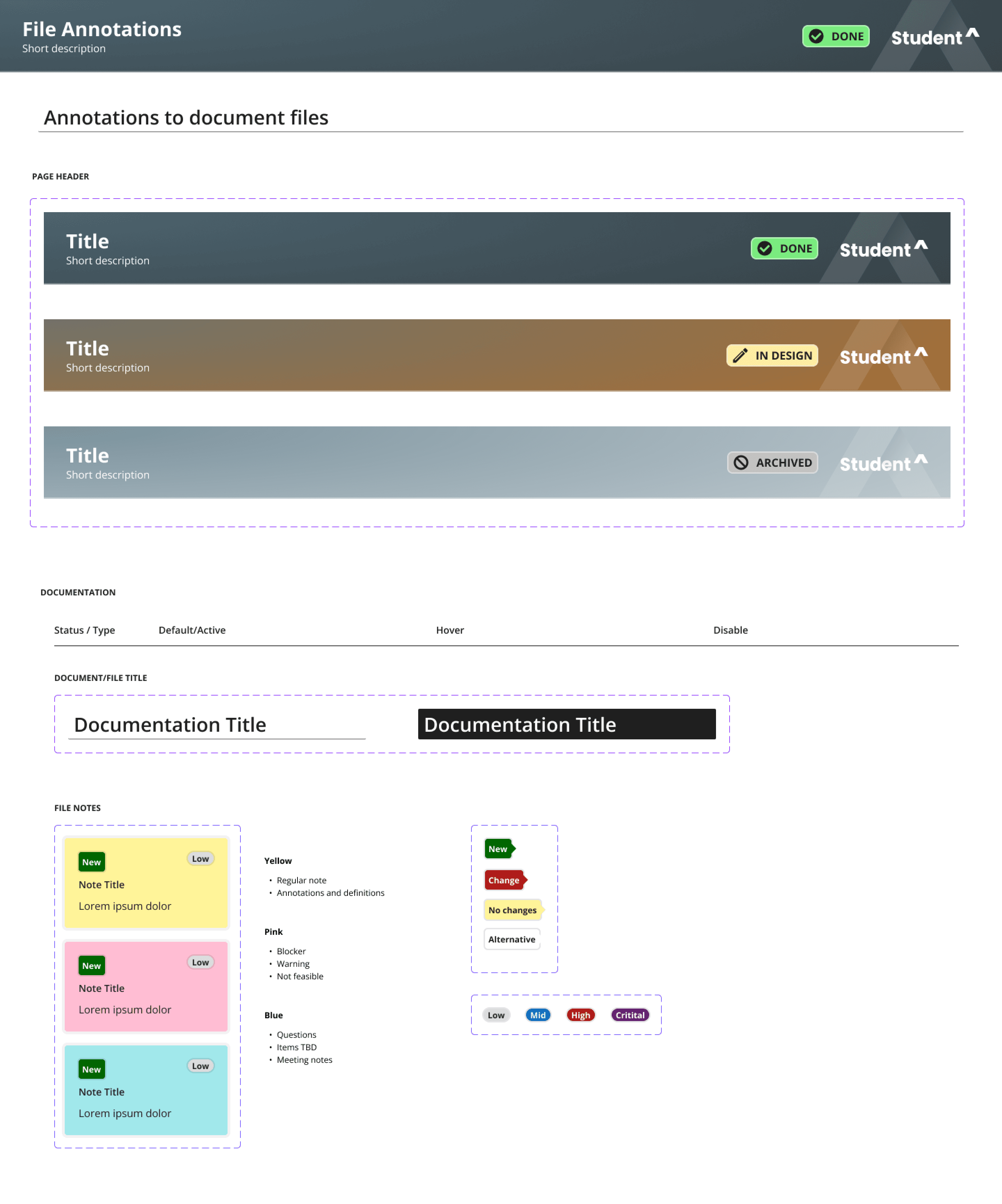
Annotations in Design Files
The creation of annotation components within the design files was undertaken with the objective of facilitating communication and ensuring clarity. These annotation tools permit the efficient marking and commenting directly within the design system files, thereby enabling enhanced feedback and collaboration among team members.
File Annotations for Design Tracking
The library includes comprehensive file annotations, which facilitate the design process and ensure clarity. Key features include:
Page Headers with Statuses: Clearly indicate the current state of each design, whether it's a draft, in review, or finalized.
Document Titles: Ensure easy identification and organization of files.
File Notes: Provide contextual information and updates directly within the design files.
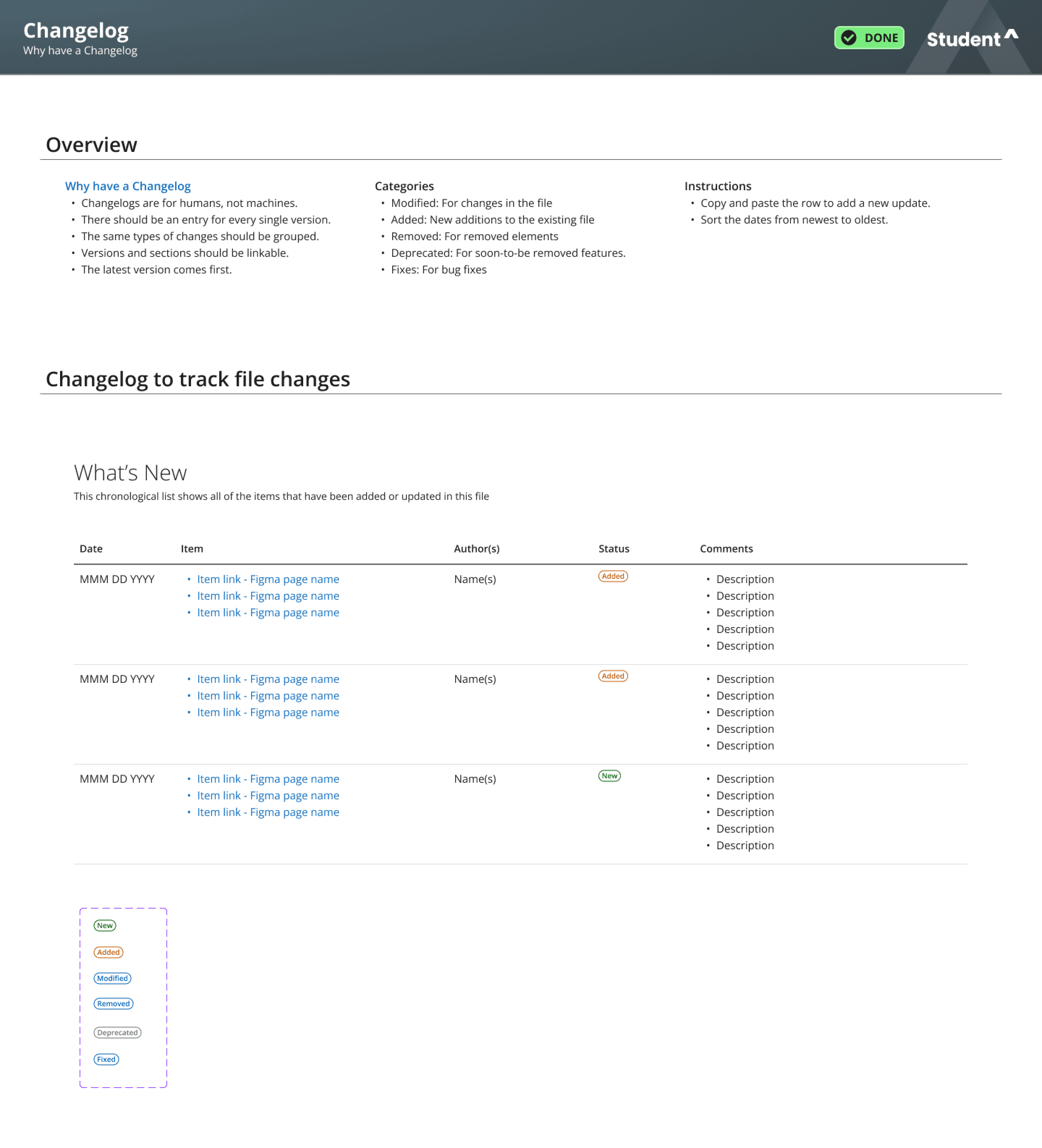
Change Log: Track revisions and updates to monitor design evolution and decisions.
The annotations facilitate the monitoring of design efforts and foster collaboration throughout the mockup creation process.
Delivery and Documentation
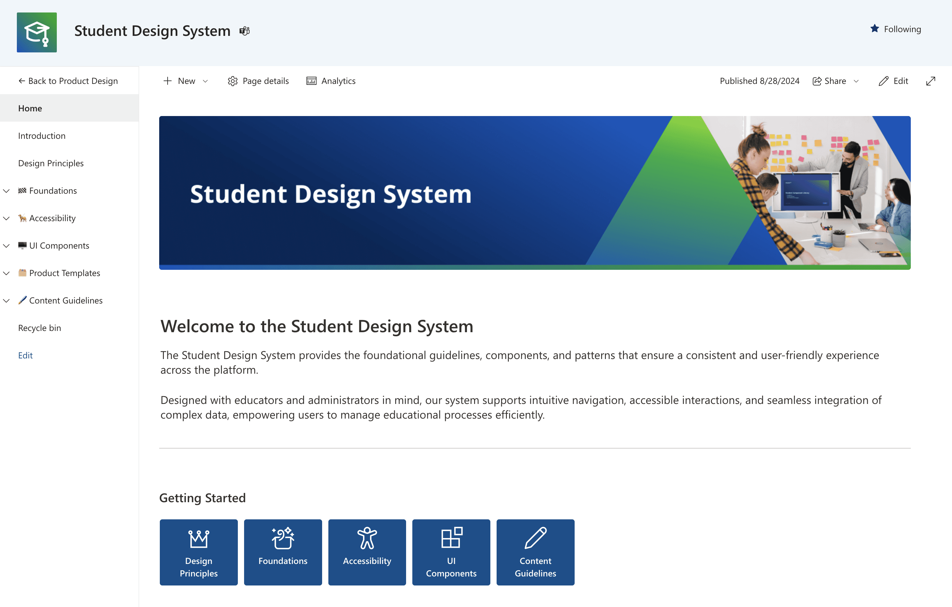
A comprehensive SharePoint website was created to serve as the repository and organizing structure for the design system.
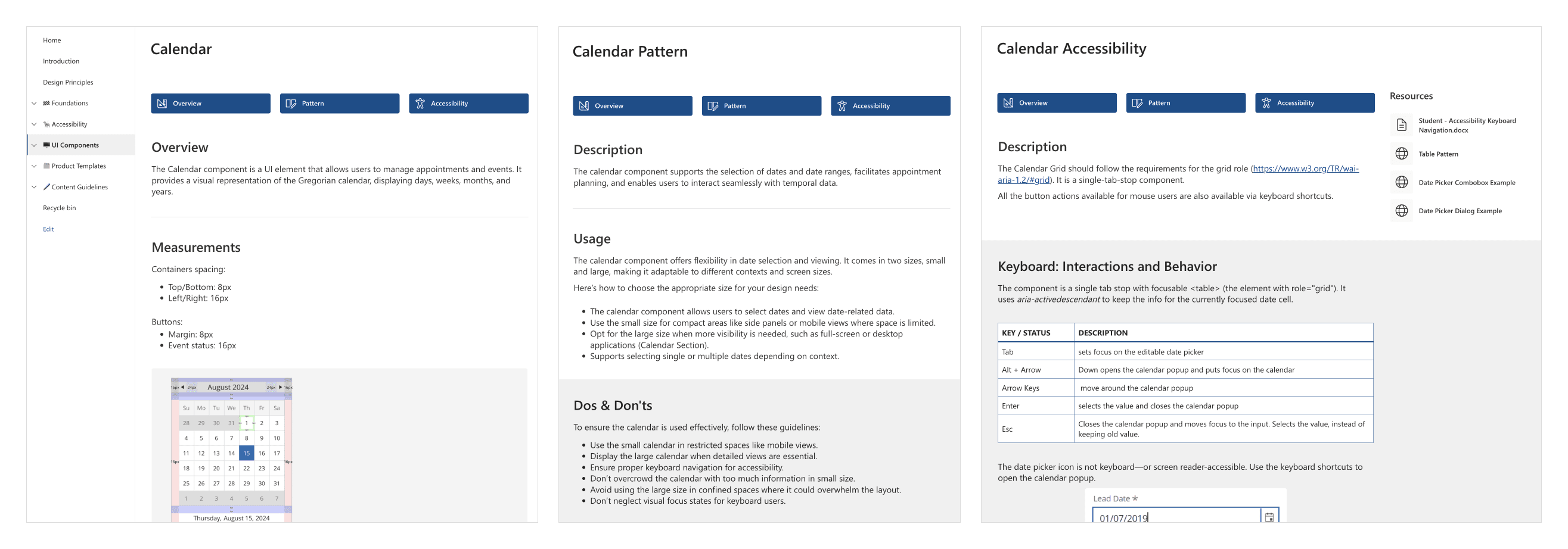
In addition to the component libraries, the SharePoint includes comprehensive documentation on design principles, foundational elements, and accessibility compliance. The site also features complete documentation for UI components, product templates, design patterns, and content guidelines, ensuring that all aspects of the design system are readily accessible and well-documented.
Centralized Hub: Created a SharePoint site as the central resource for the design system.
Comprehensive Documentation: Included specifications for design principles, foundational styles, and accessibility.
UI Component Library: Documented the UI component library with implementation guidelines.
Template and Pattern Specs: Provided documentation for product templates and design patterns.
Content Guidelines: Detailed guidelines for writing tone, style, terminology, and a comprehensive glossary.
Takeaways
The project demonstrated the complexity and importance of updating legacy systems while keeping user experience and design integrity at the forefront.
Legacy considerations: Balancing the preservation of the product's legacy design with modern requirements was a key learning point.
Design flexibility: The importance of creating a flexible and scalable design system that can adapt to future needs was emphasized.
User-centric approach: Ensuring that design improvements were driven by user needs resulted in a more intuitive and satisfying user experience.
Collaboration: Ongoing collaboration and feedback loops were critical to a successful design overhaul.